Print Campaign
Battle of the Bands
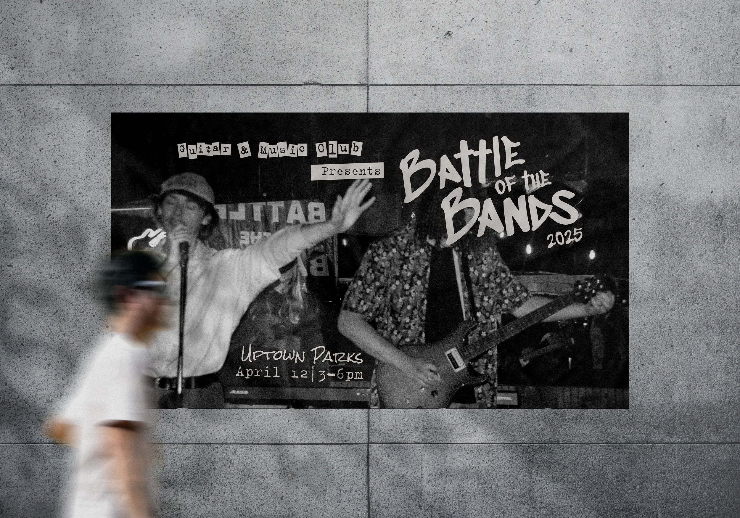
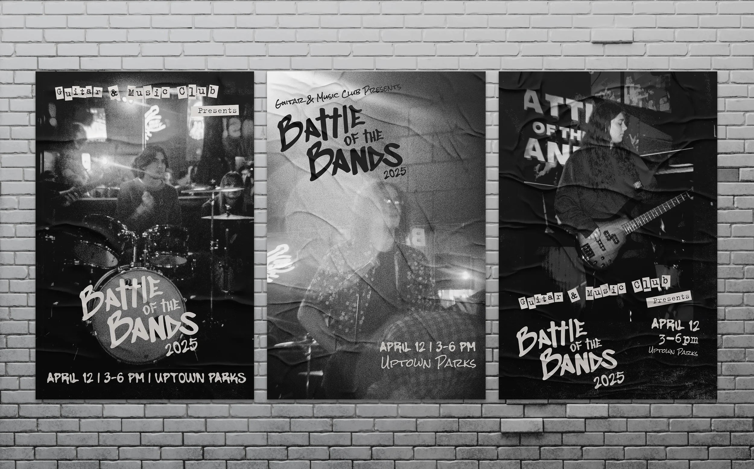
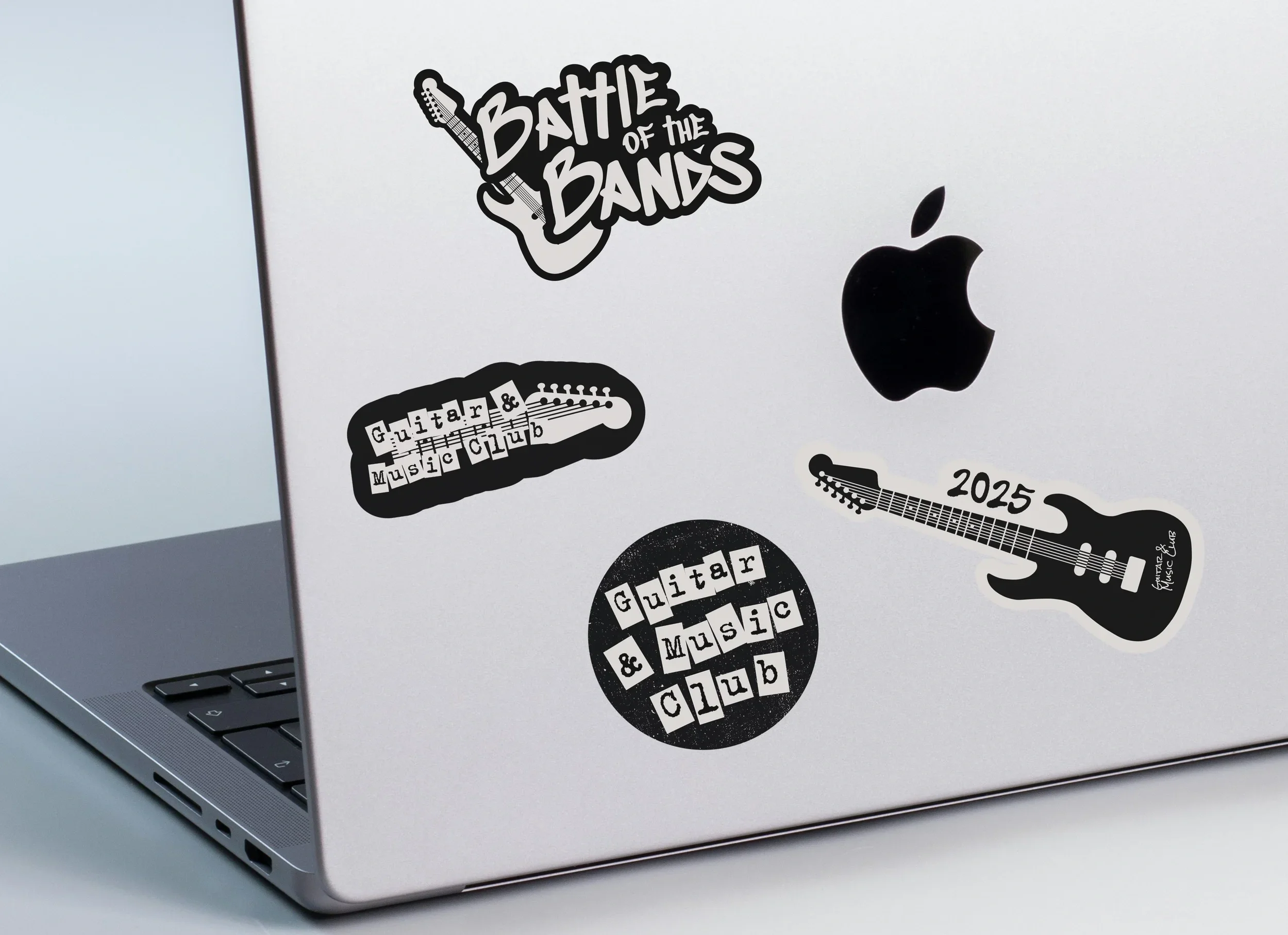
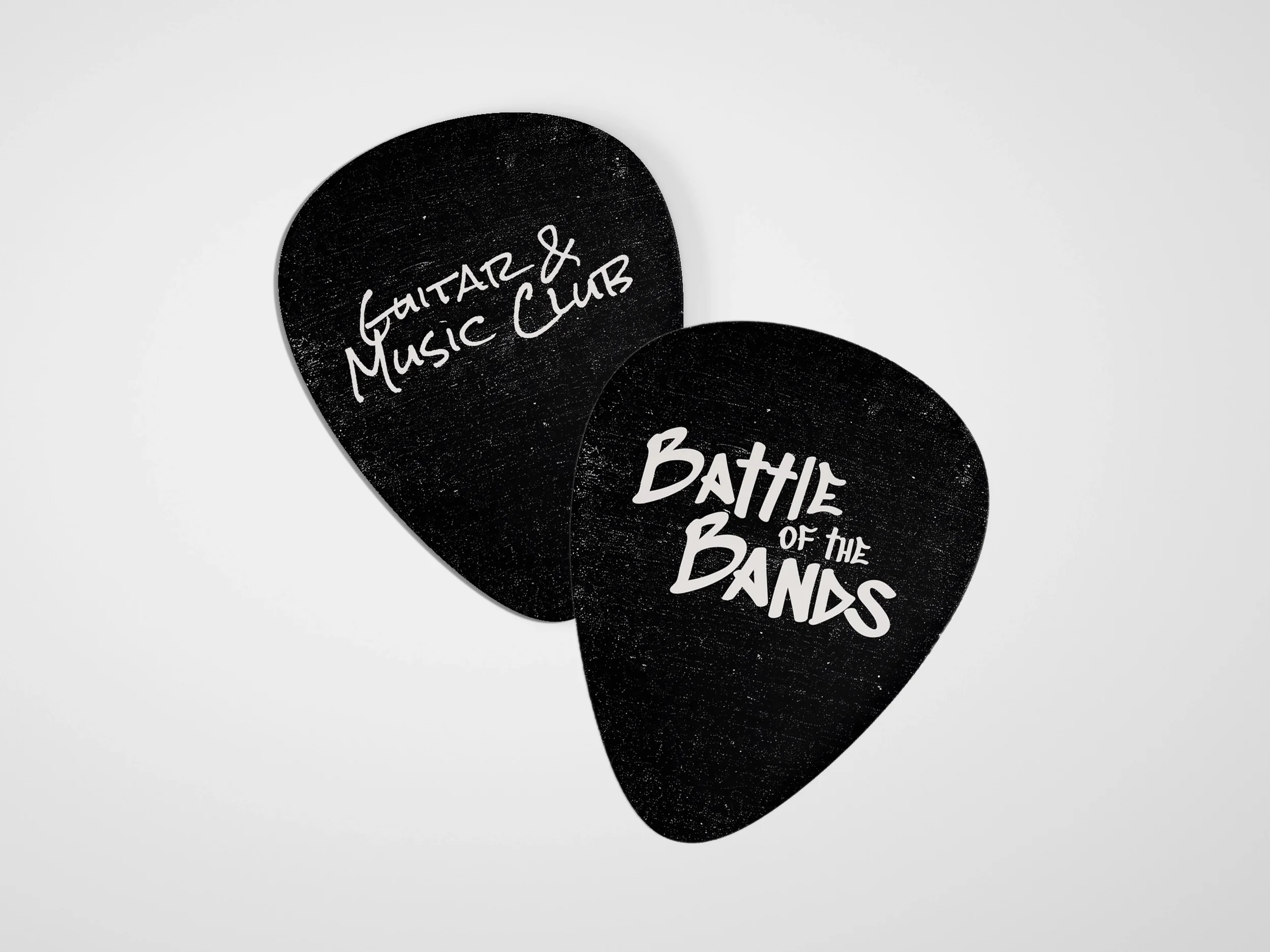
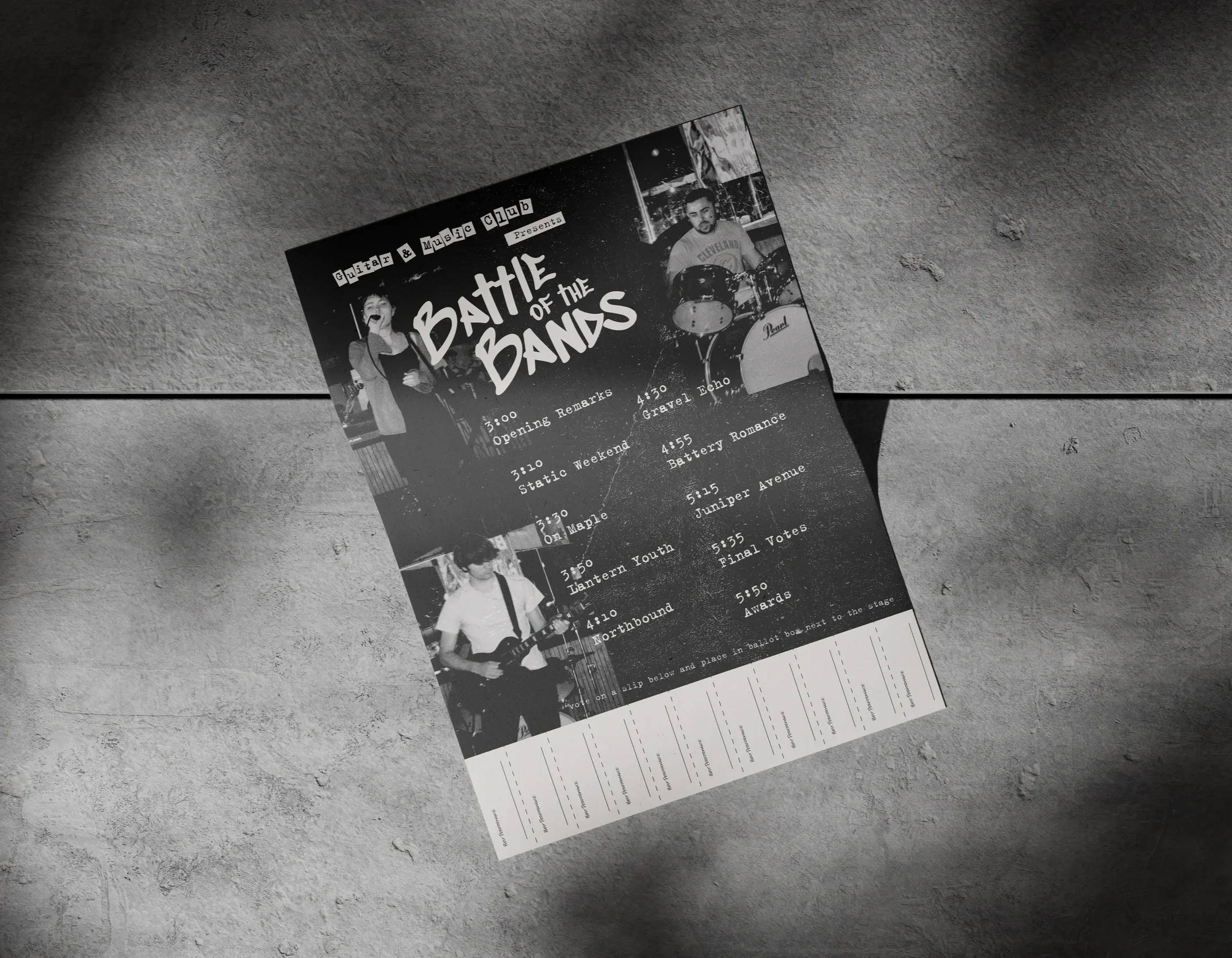
I was hired by Miami University's Guitar & Music Club to design a logo and print campaign for their 2025 Battle of the Bands event. The event’s vibe and purpose were centered around a casual but grungy vibe that aligned with the style of the venue and performers. Focusing on creating physical takeaway materials like guitar pics, interactive posters, and stickers enhanced the event experience for performers and the audience.
Style Board
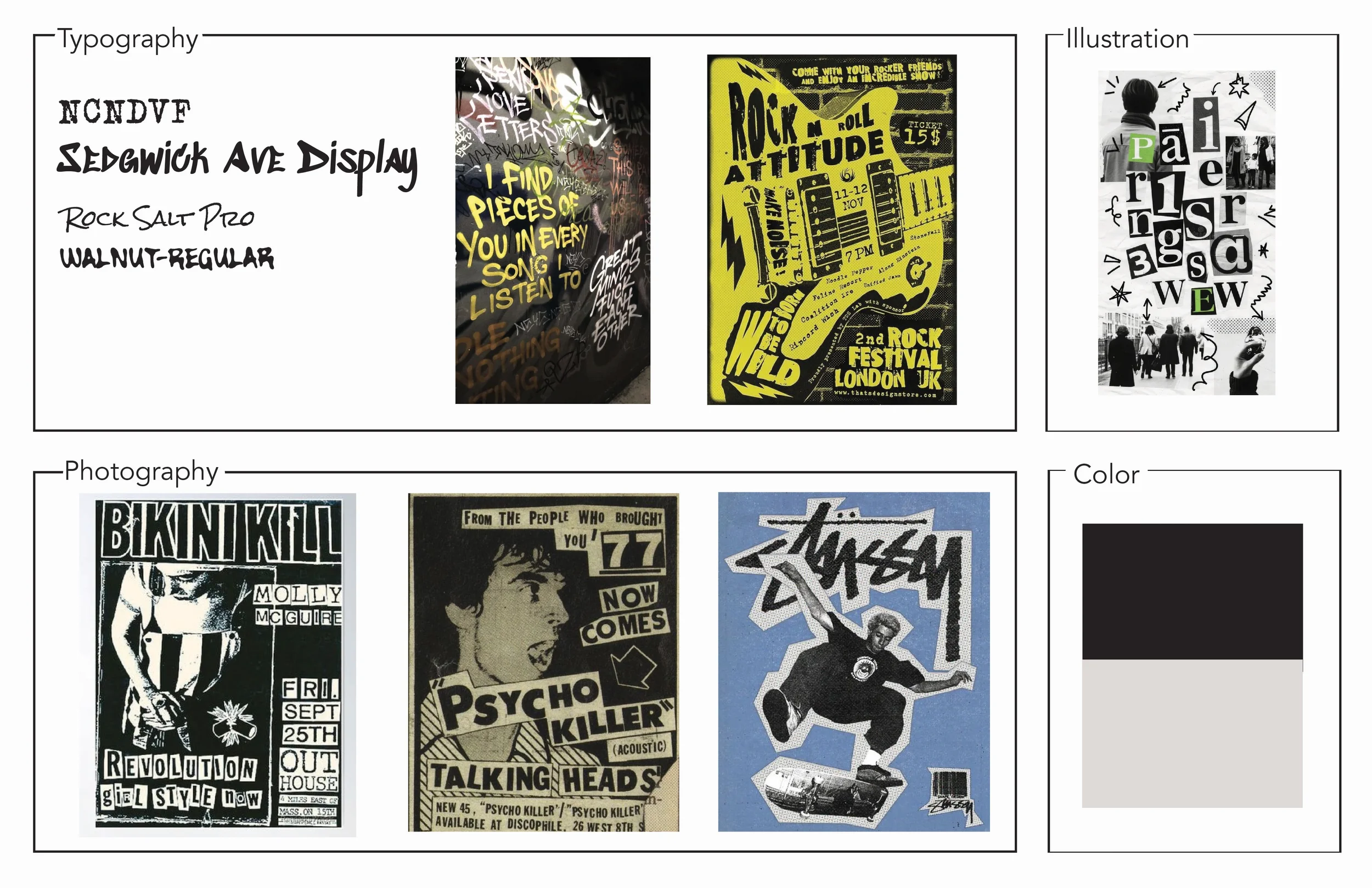
To define the campaign’s visual direction, I aimed to create a “lived-in” feel. Graffiti-inspired lettering influenced the logo design, while loose, experimental typography replaced a rigid grid structure. Two-toned photography was chosen over full color to push a more raw, hardcore look. The resulting style board leans heavily into a grunge aesthetic.
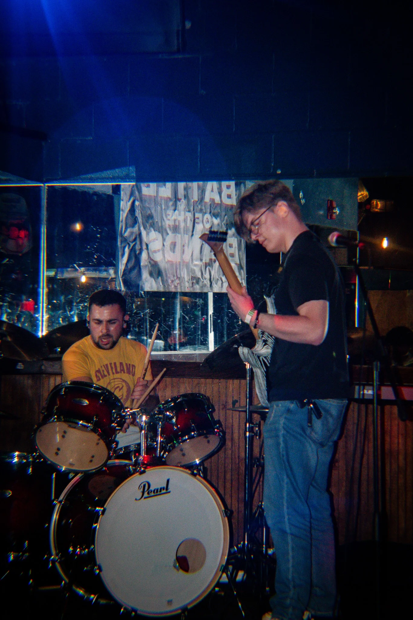
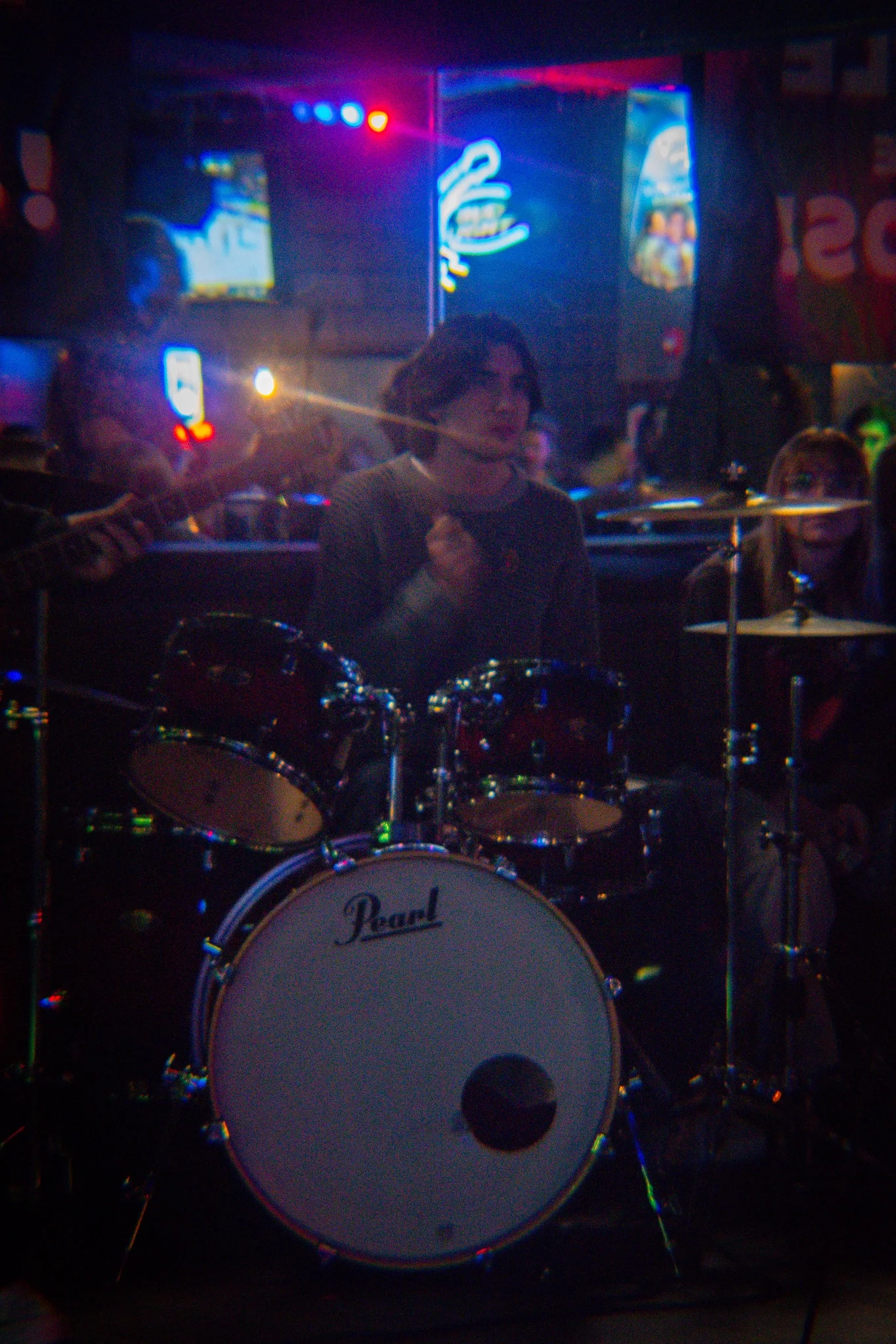
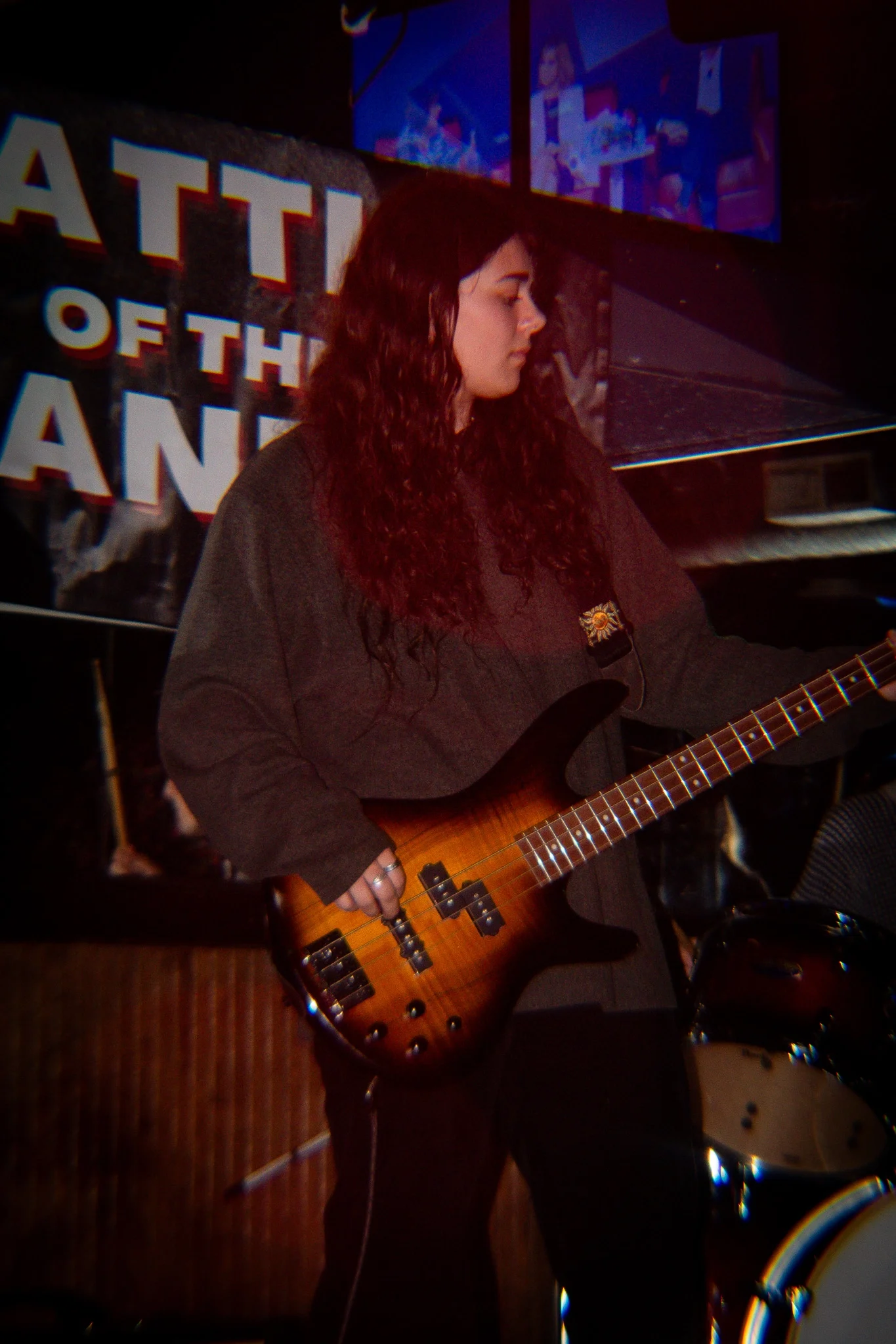
Photography
The club provided high-quality photography that I stylized to support the event’s visual identity. My goal was to introduce drama and a worn texture while maintaining cohesion across the full set. Because the original images were well composed, I focused on enhancing contrast, posterization, and applying a duotone treatment using the brand’s two core colors. The restrained, no-frills approach positions the event as a part of an underground music scene.
I learned how physical, interactive, and takeaway print pieces can deepen an event’s atmosphere and make a visual identity feel lived-in, not just advertised.
Explore More Work