
Brand & Identity Design
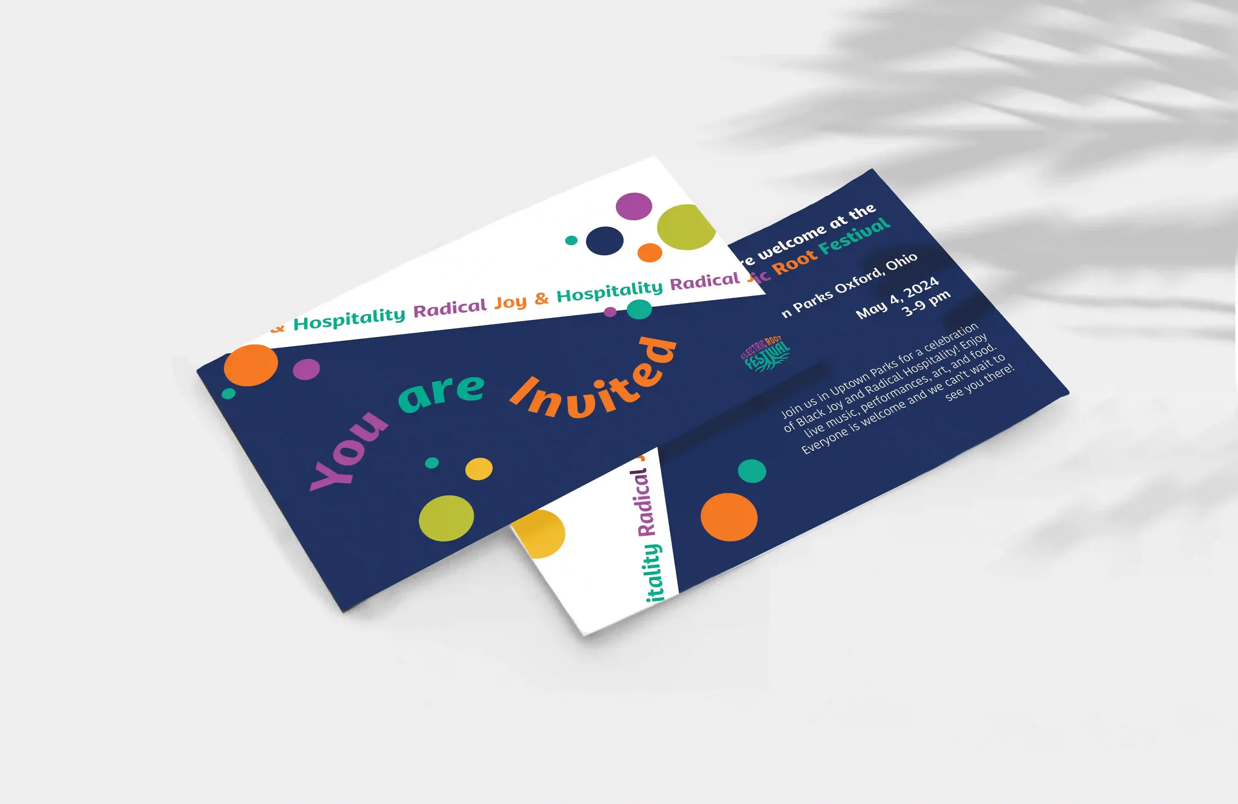
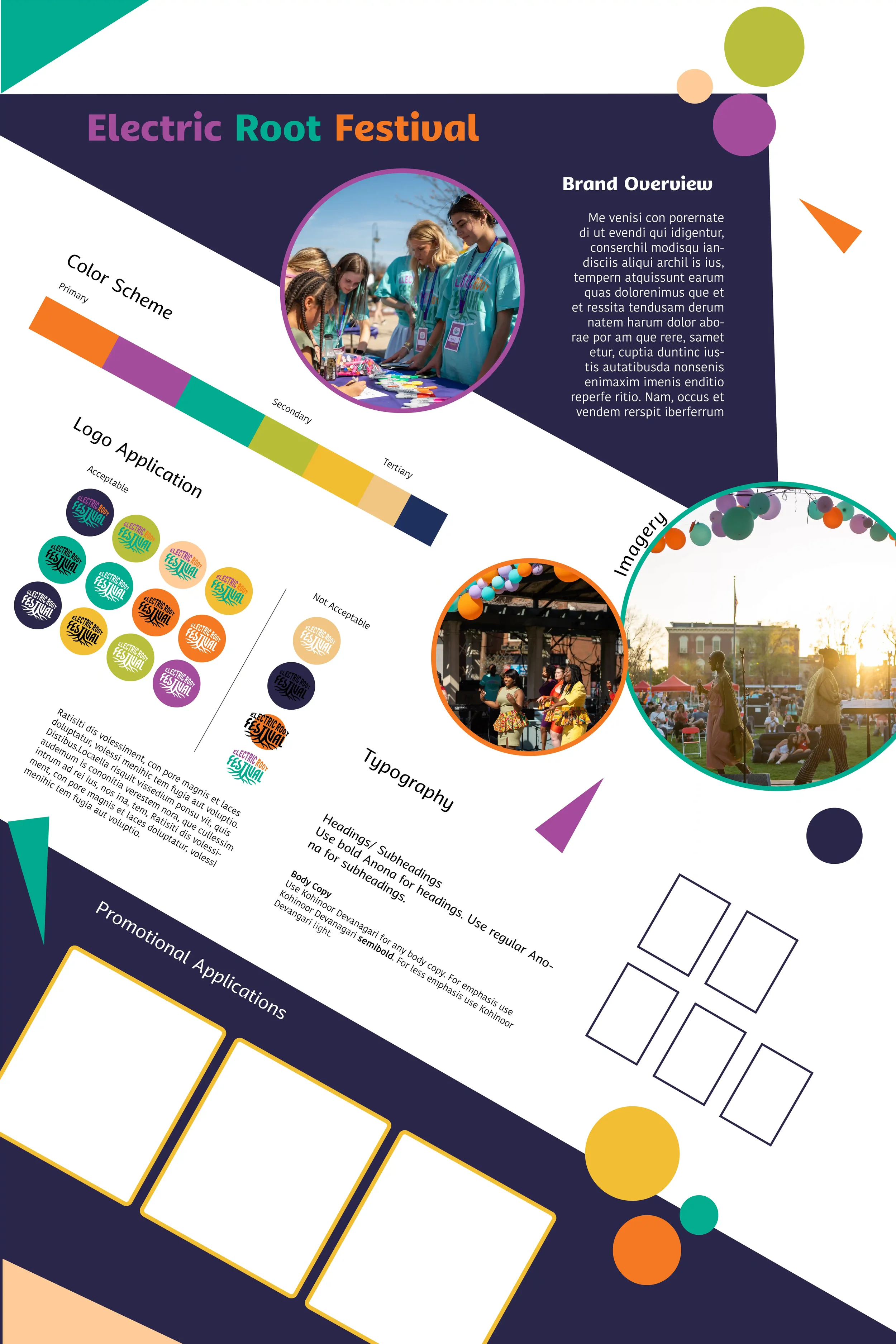
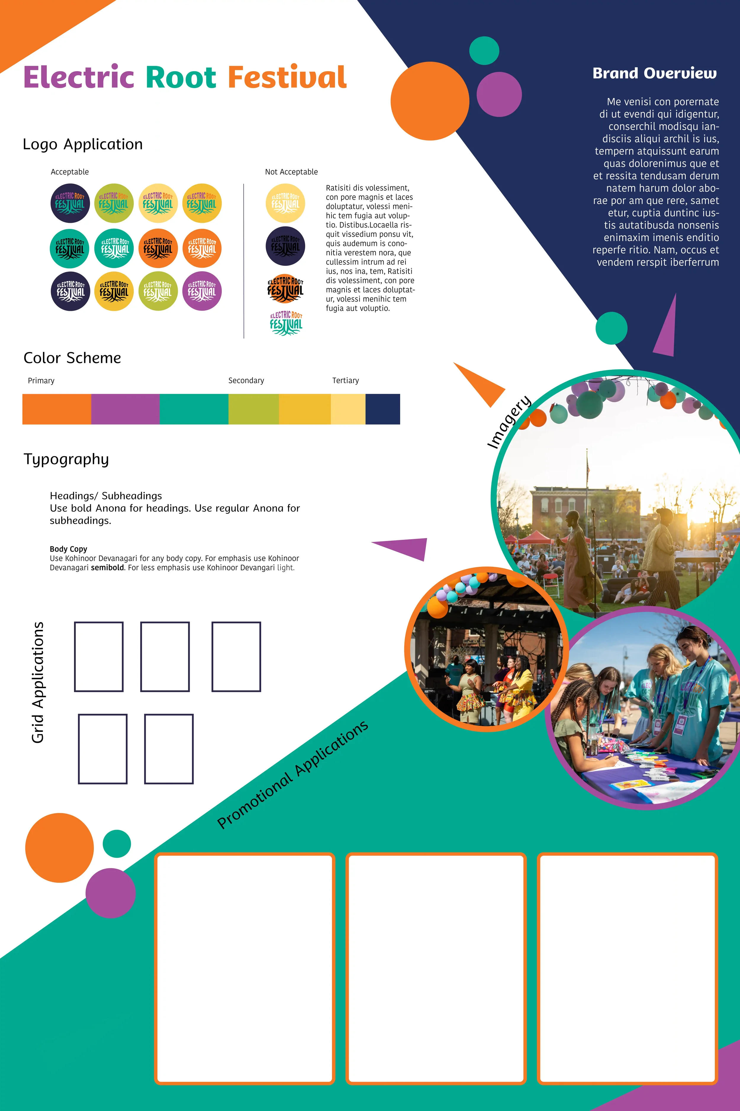
Electric Root Festival
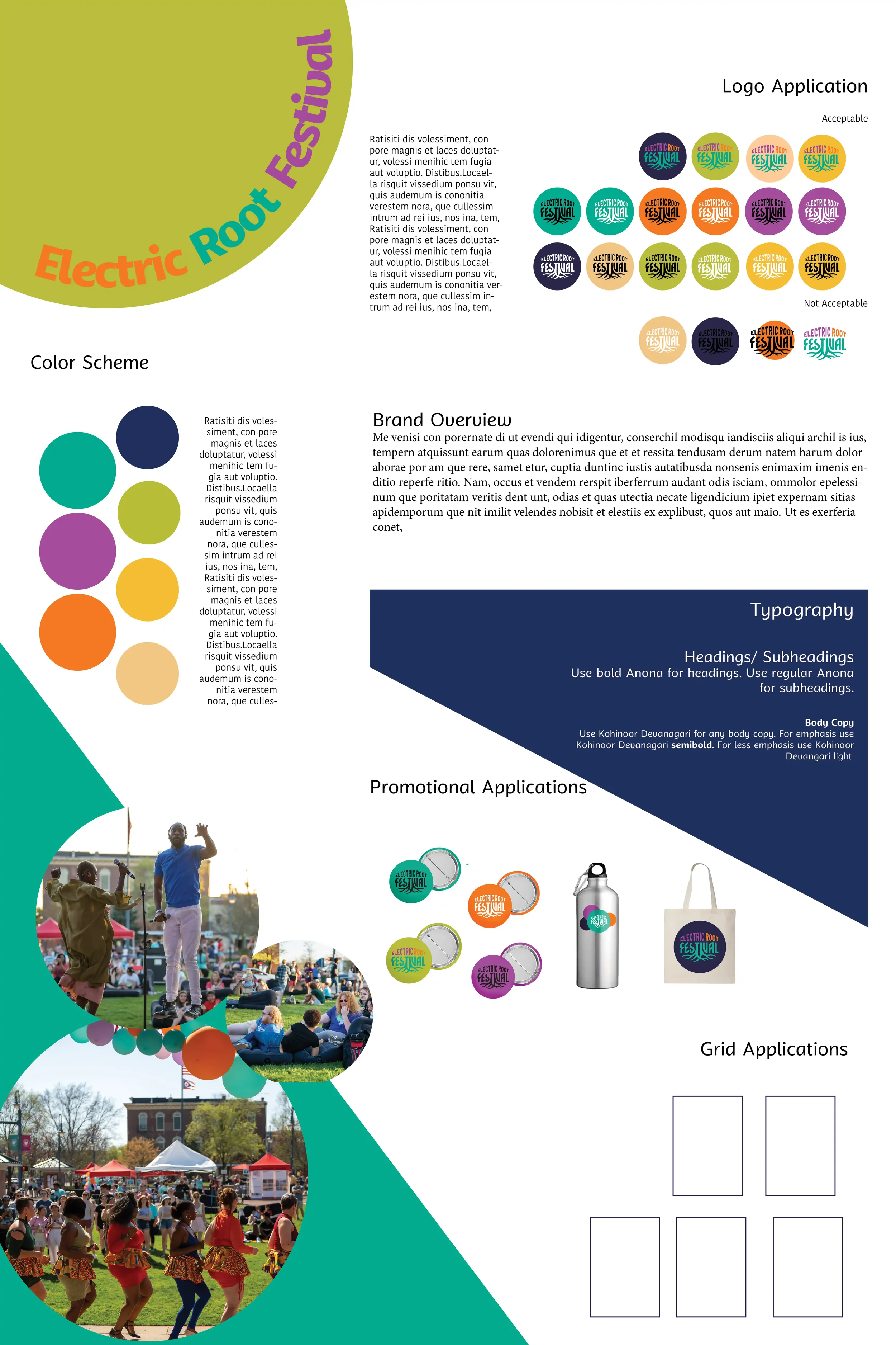
Develop a flexible visual identity system for the Electric Root Festival that celebrates Black joy and radical hospitality while adapting across print, digital, and environmental applications.
The problem
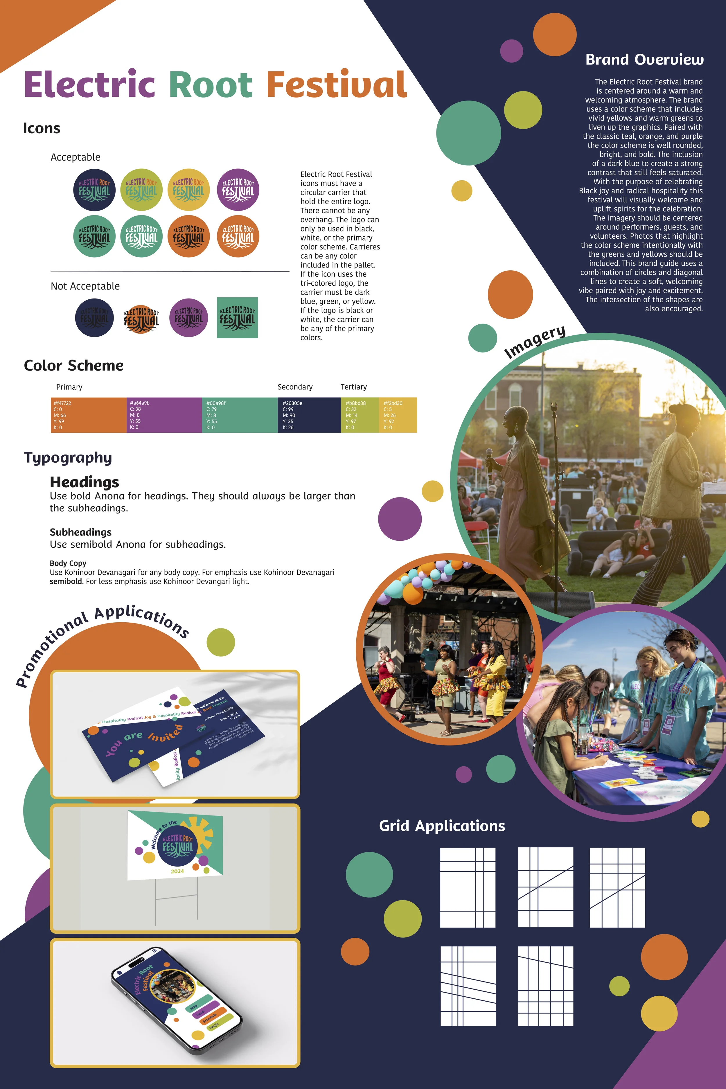
A friendly typeface with petal-like letterforms helps create an approachable identity while reinforcing the festival’s springtime atmosphere.
Typography
The color palette replaces harsh black elements with navy blue for a richer, more saturated feel, while warm greens and yellows evoke spring, growth, and sunshine. Together, these updates create a more welcoming and vibrant identity than previous years.
Color
The visual system evolves the festival’s balloon-inspired imagery through circles and diagonal lines, creating a sense of movement and energy while maintaining continuity with previous branding.
Shapes
By combining approachable typography, vibrant spring colors, and dynamic geometric forms, the Electric Root Festival identity celebrates joy while inviting connection across backgrounds.