
Brand & UX Design
Keukenhof App
Improve how visitors navigate and experience Keukenhof with an app redesign that enhances functionality and refreshes the visual system.
The problem
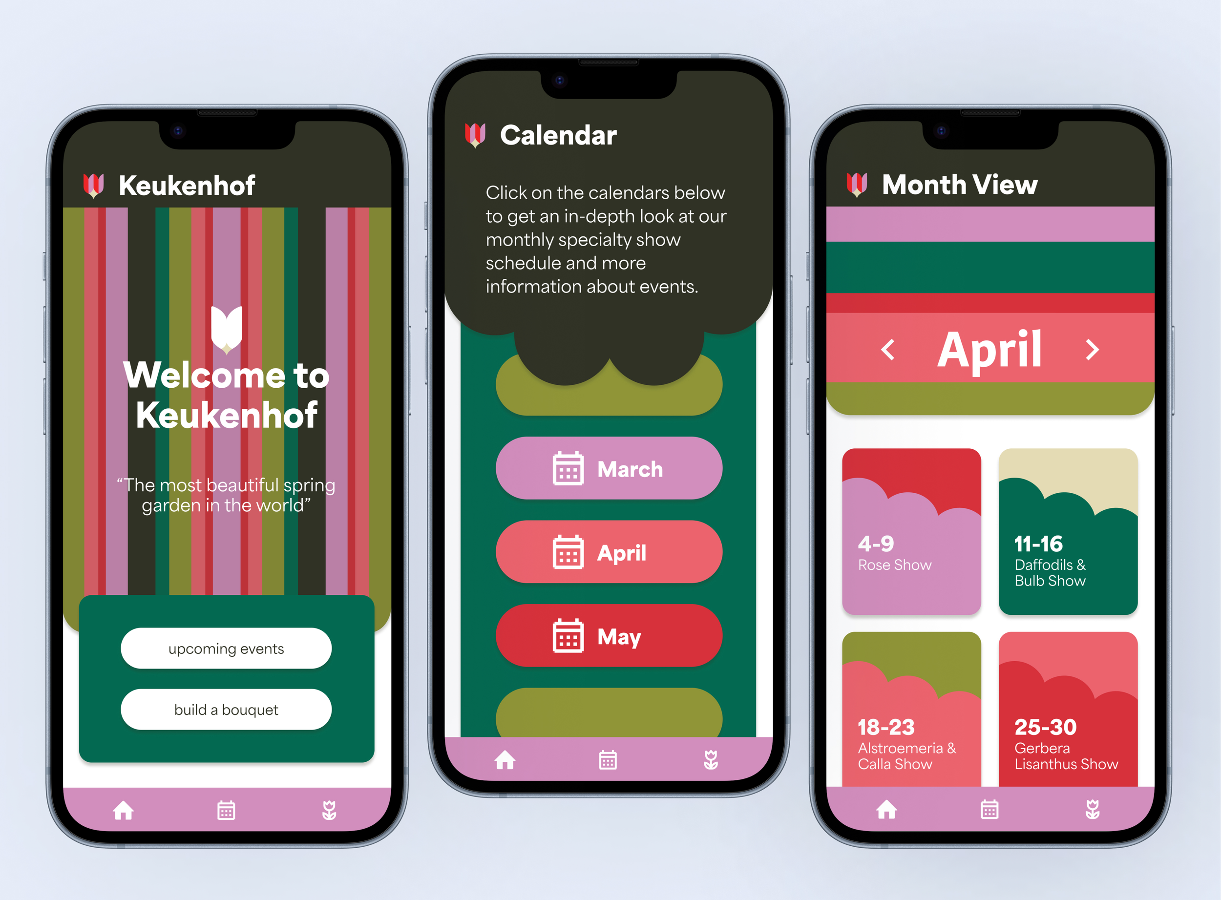
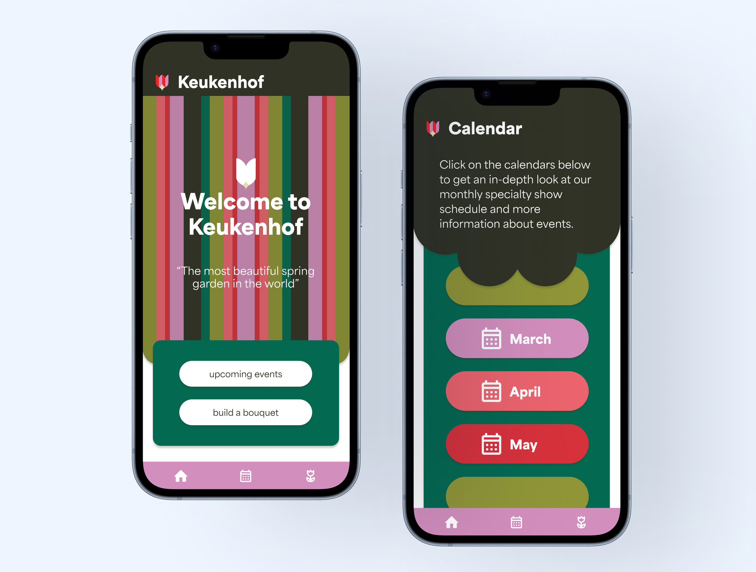
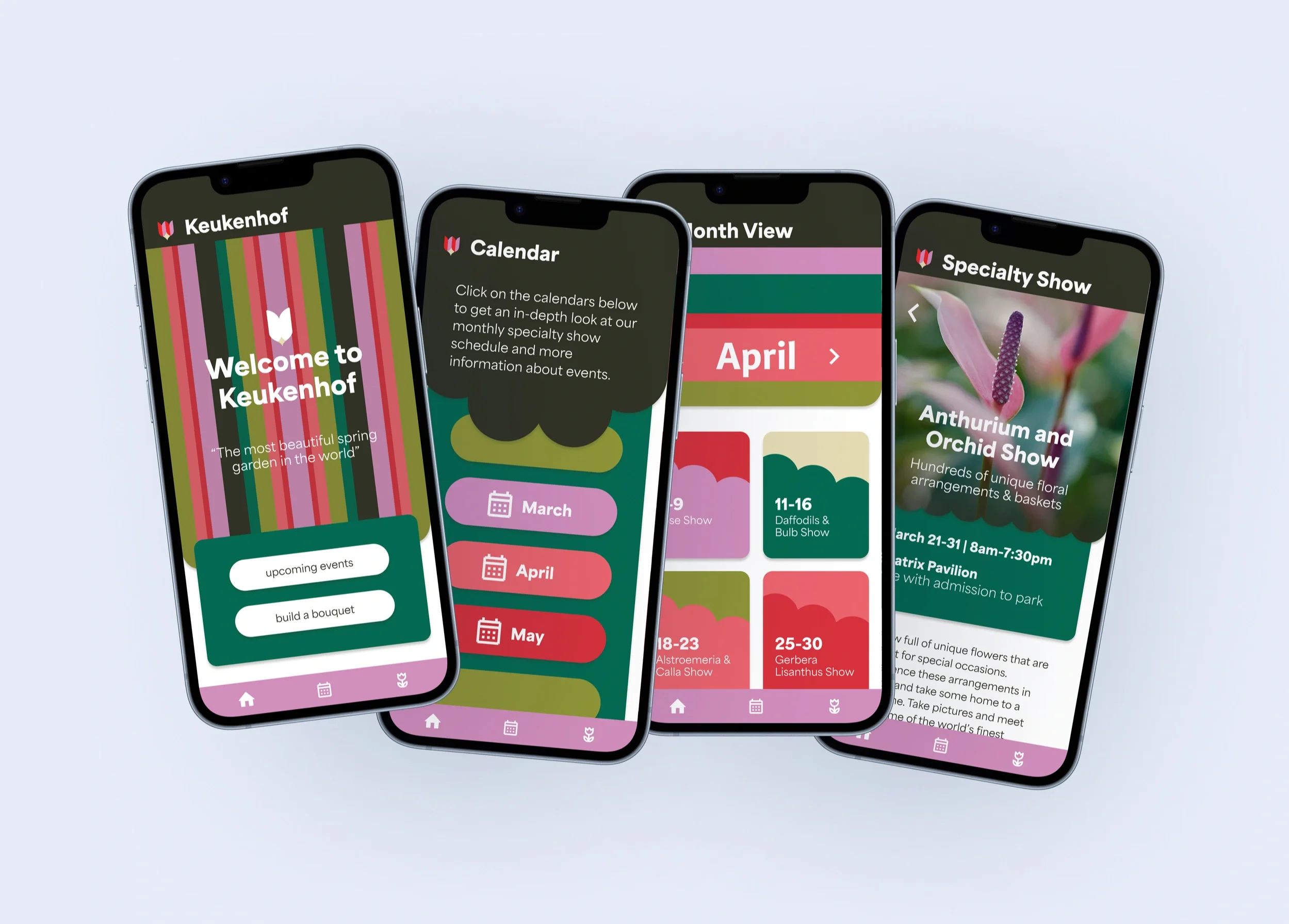
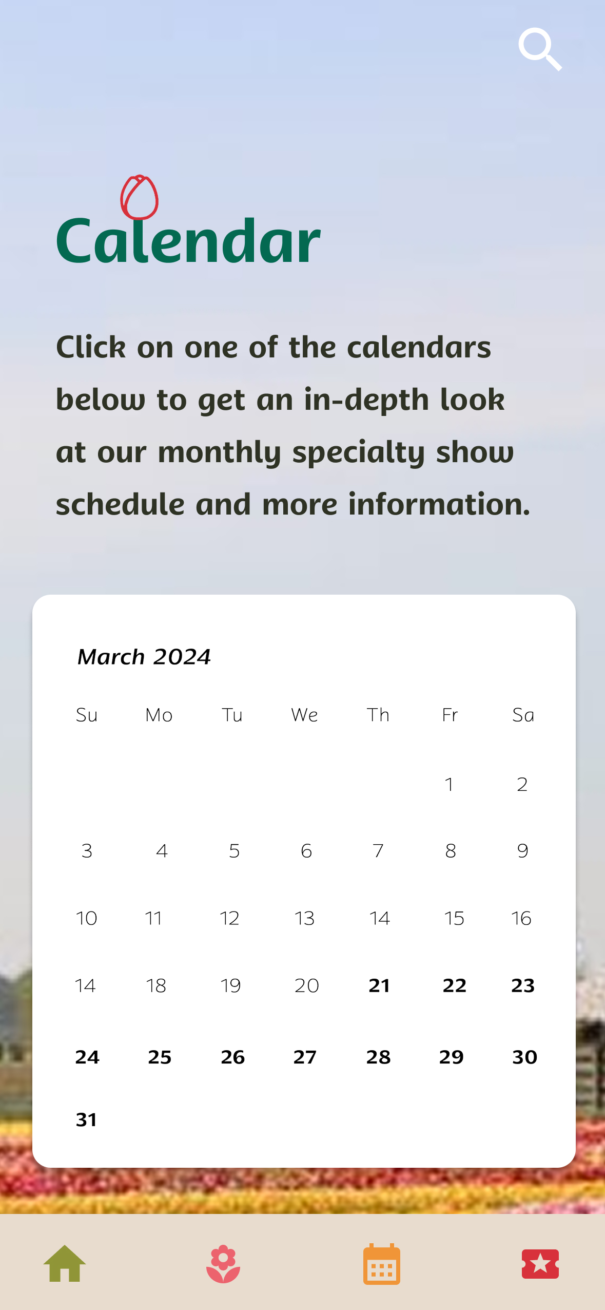
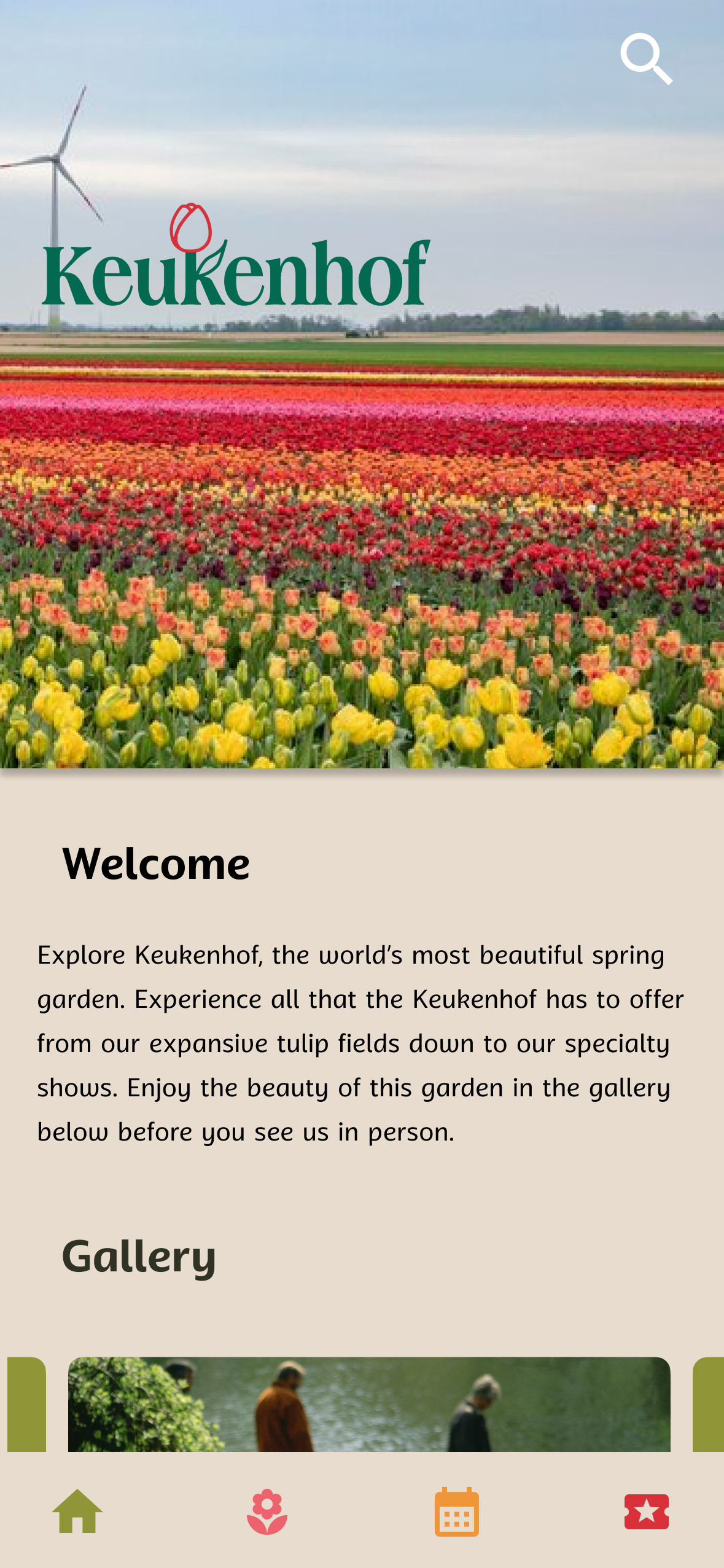
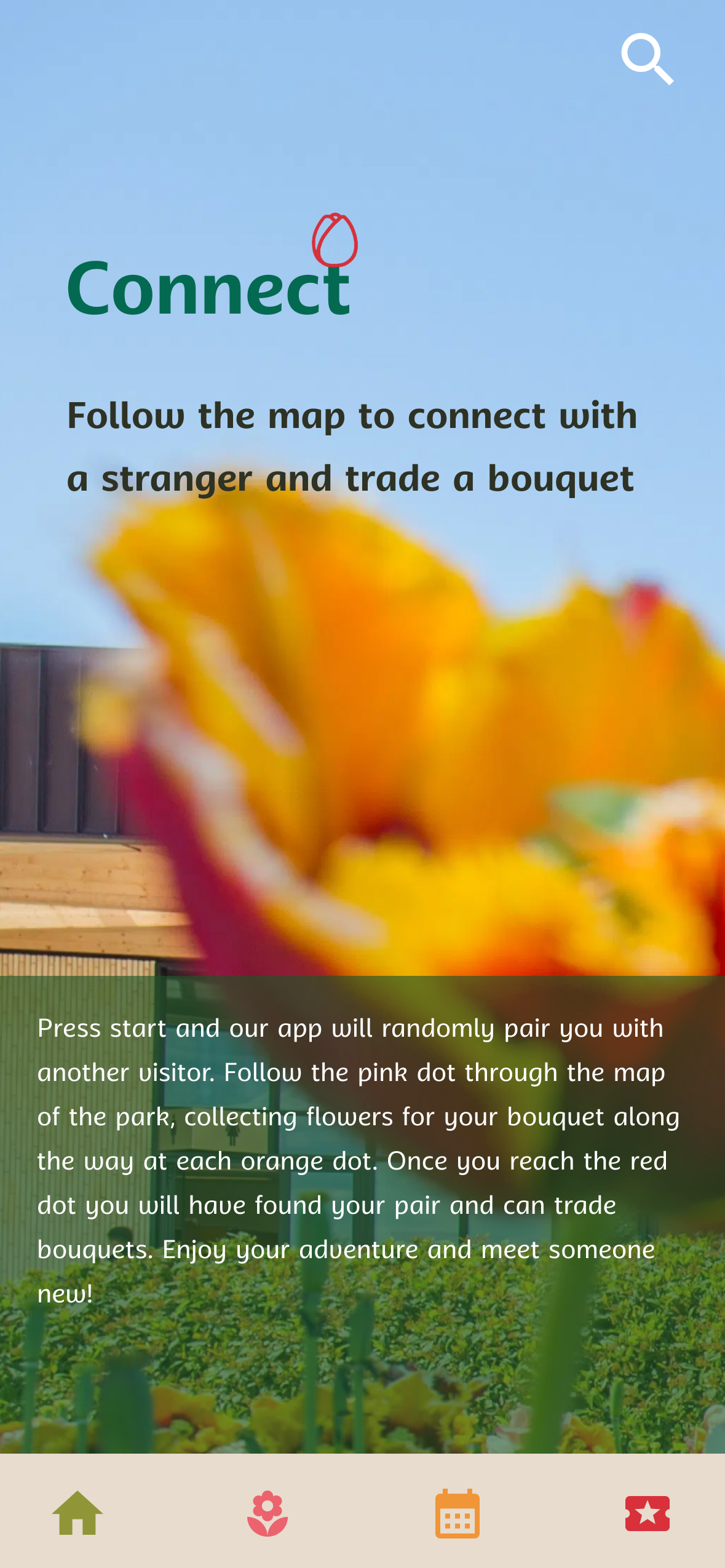
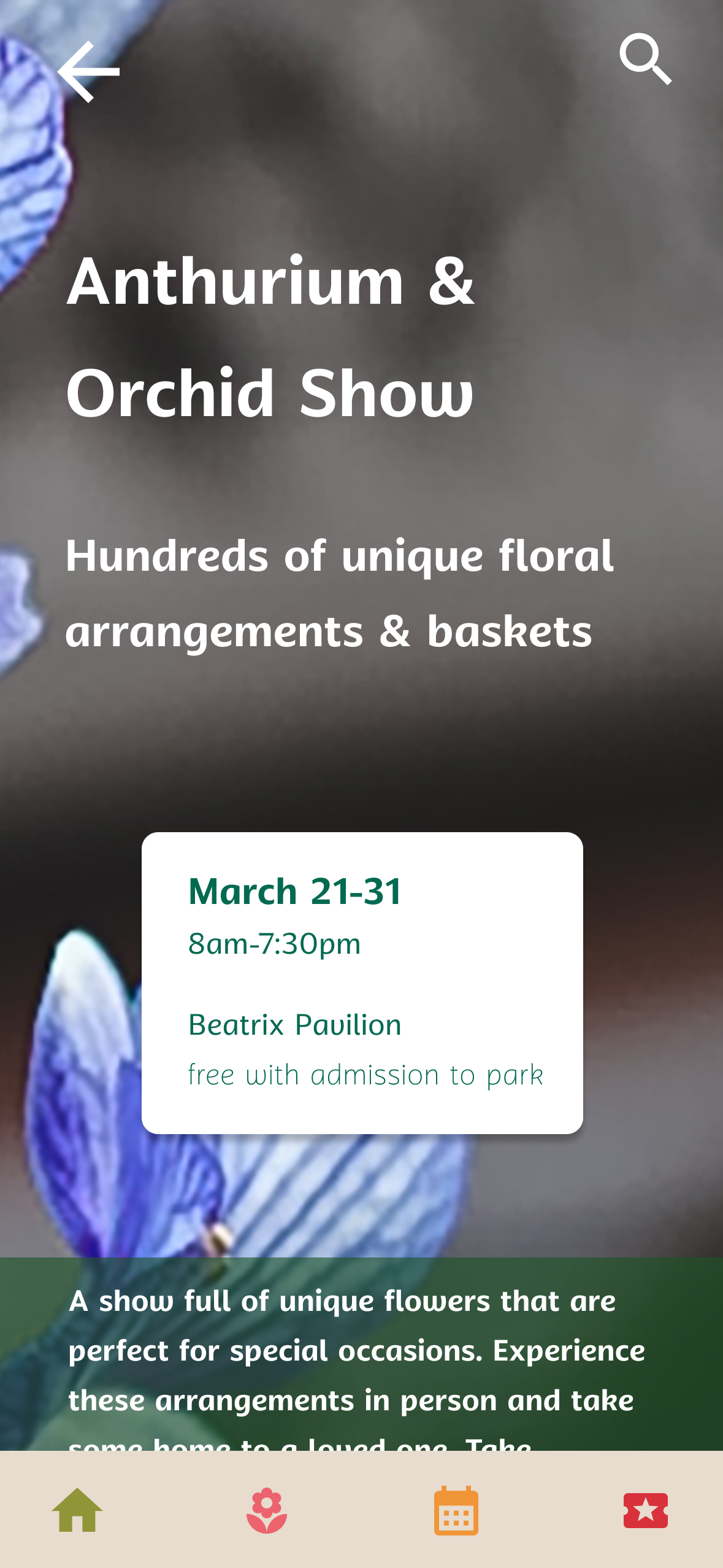
I revisited a project to create a more refined experience. By reducing unnecessary photography and focusing on content that adds value, the redesign encourages visitors to spend less time looking at their screens and more time experiencing the gardens.
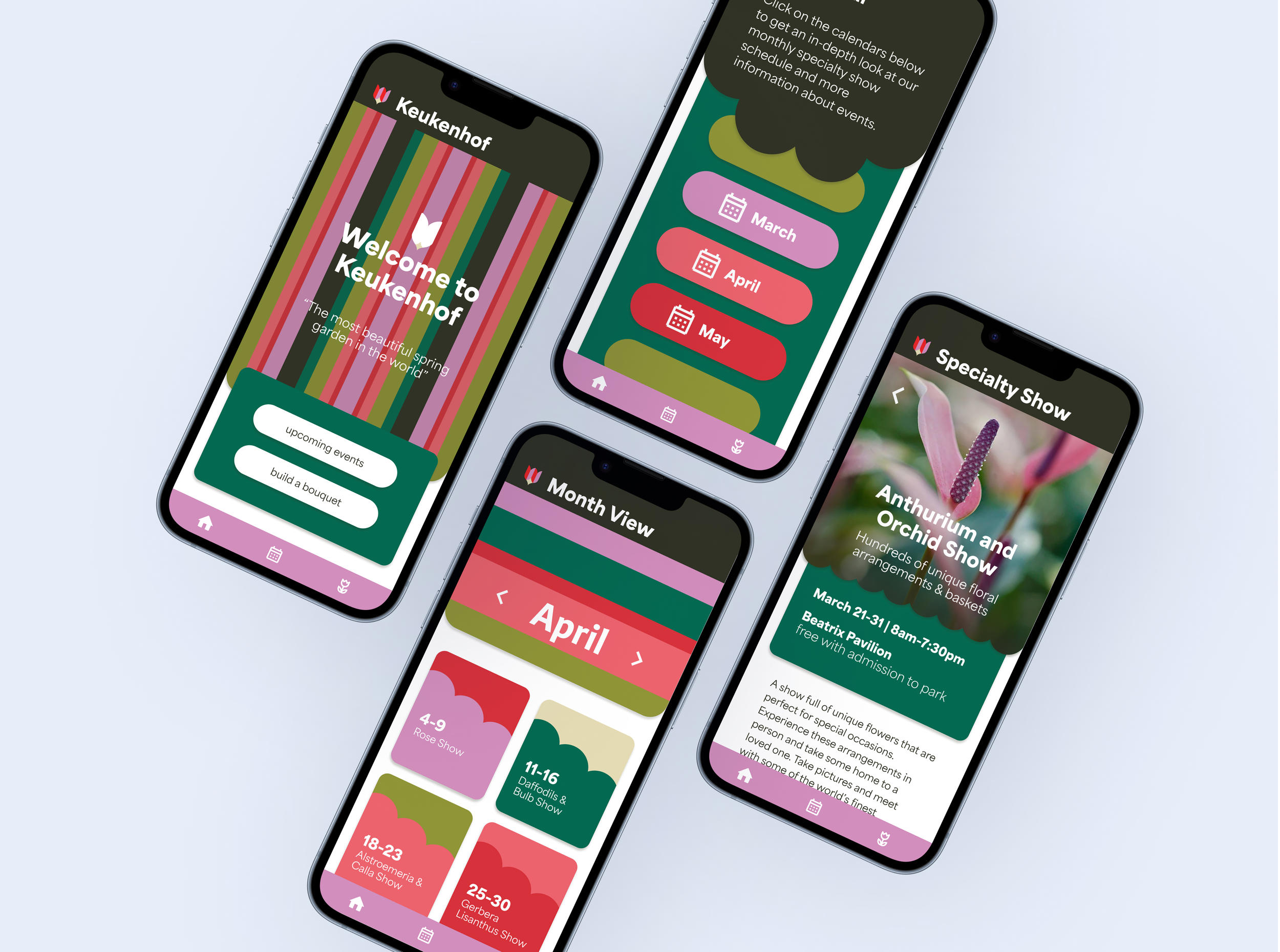
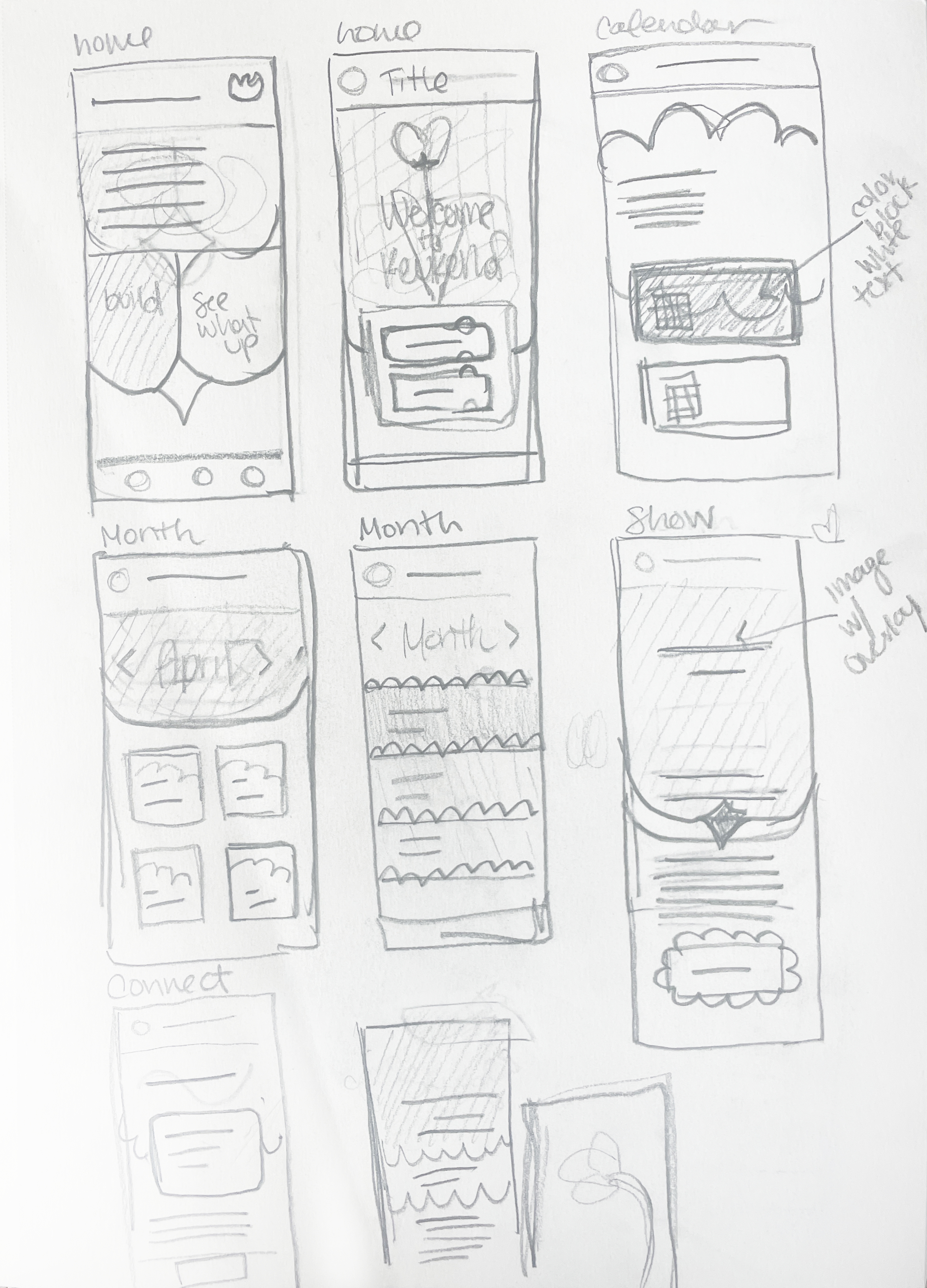
Revamping old prototype
Screens from the previous prototype
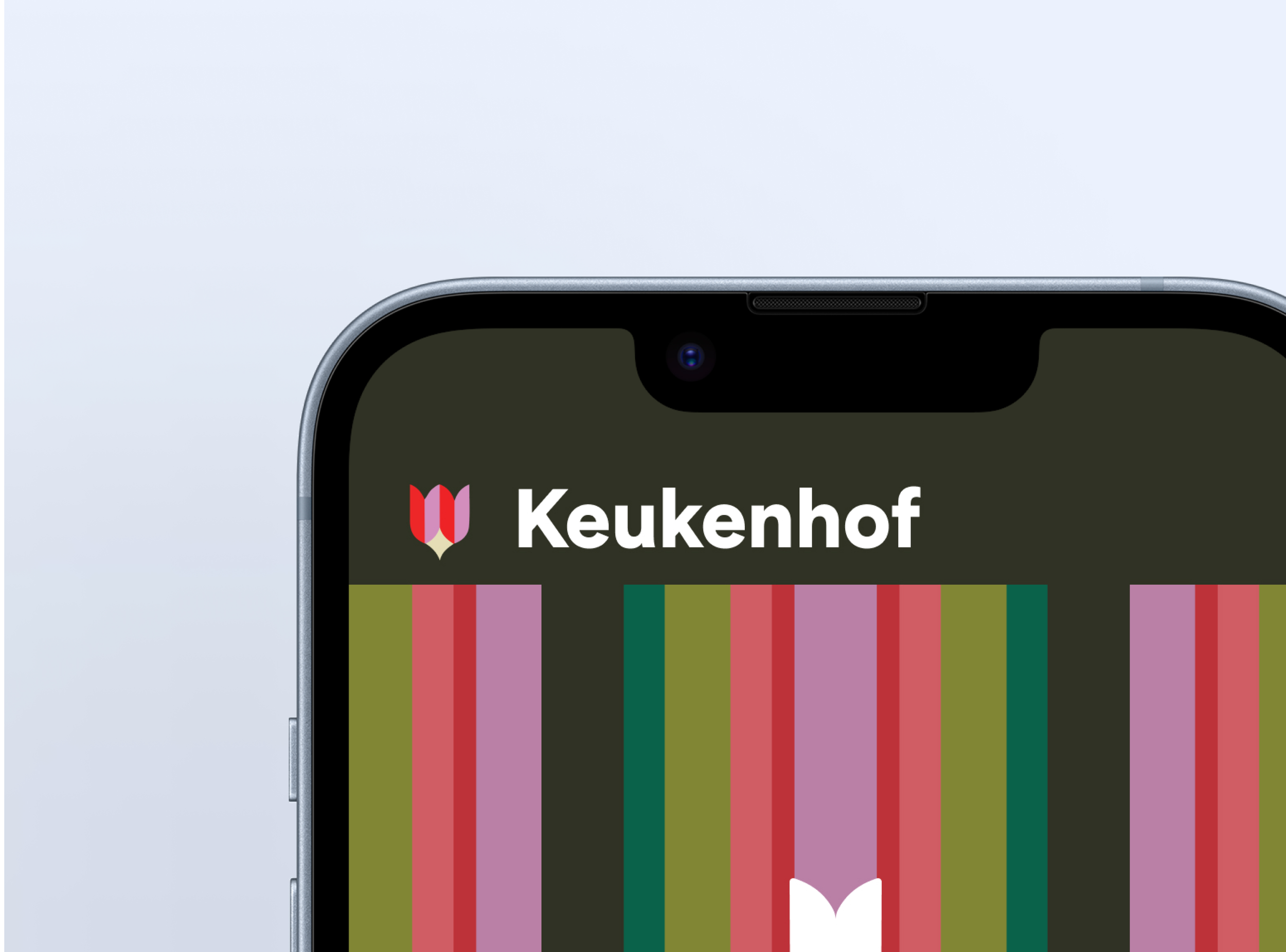
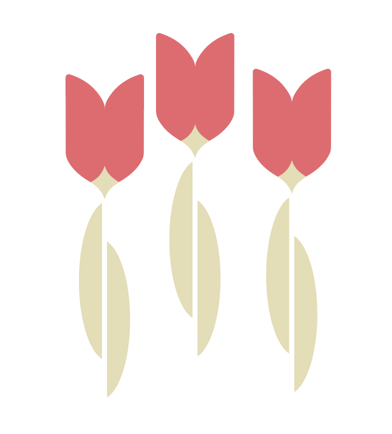
The visual system extends the logo’s shape through tulip-inspired details, striped patterns referencing Keukenhof’s flower fields, and scalloped forms that add a playful, approachable feel.
Shape

Explore the Figma prototype
Revisiting past work allowed me to transform a functional experience into an elevated, intentional design. By simplifying interactions, the app now enhances the real-world beauty of Keukenhof rather than competing with it.