
Brand & Identity Design
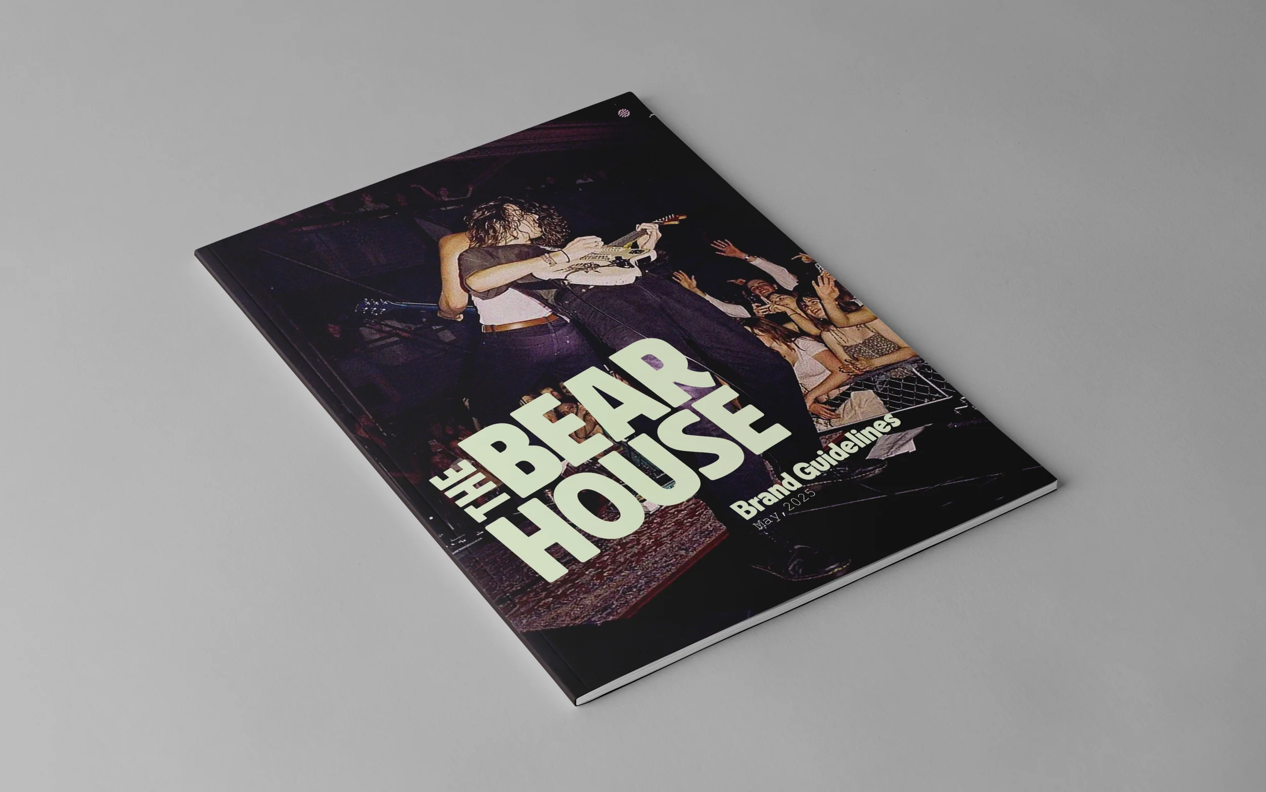
The Bear House
Create a concert venue brand that embodies the independent and fearless nature of a bear, while championing emerging artists
and authenticity.
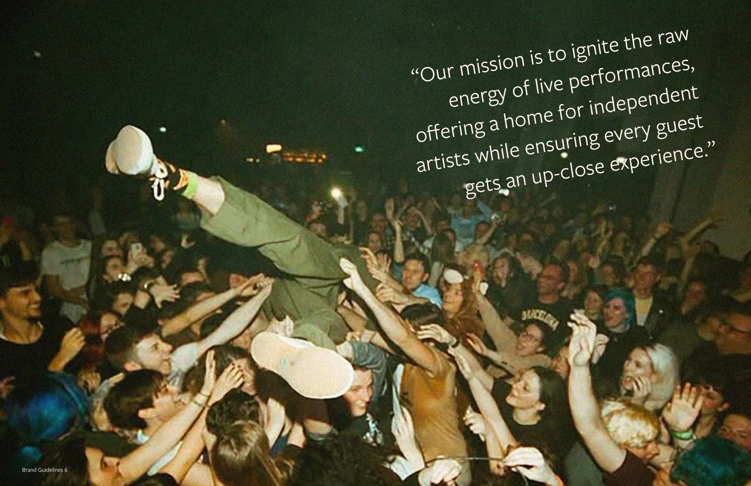
The prompt
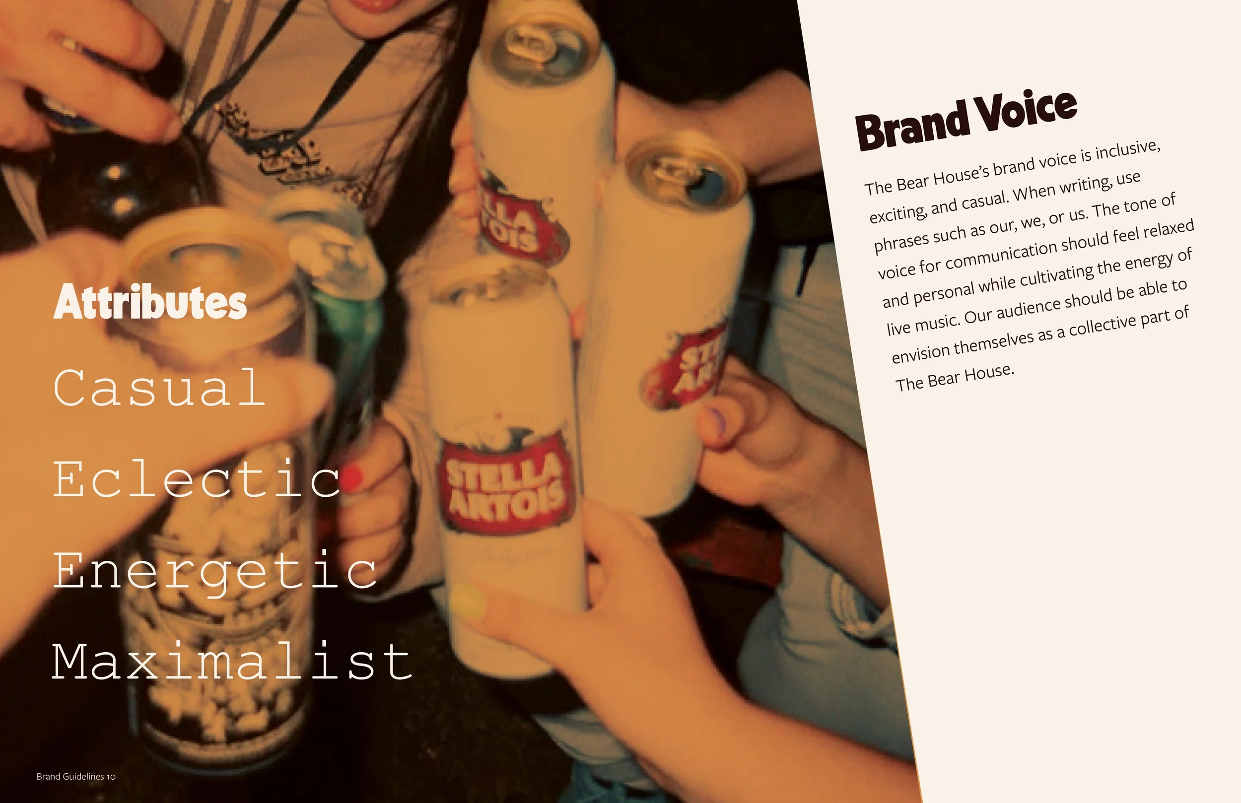
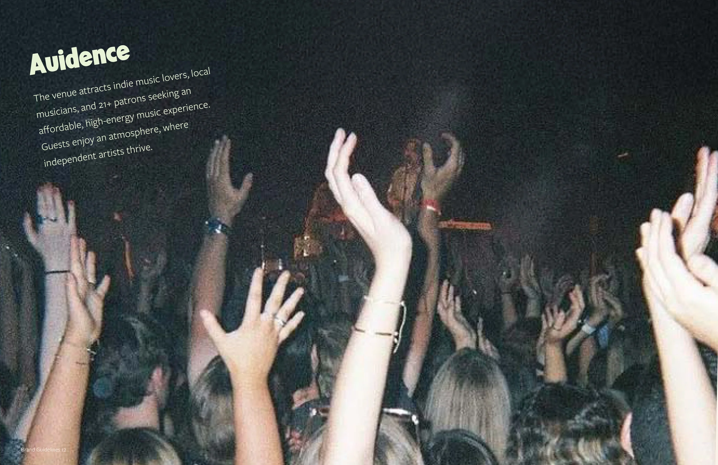
Brand guidelines

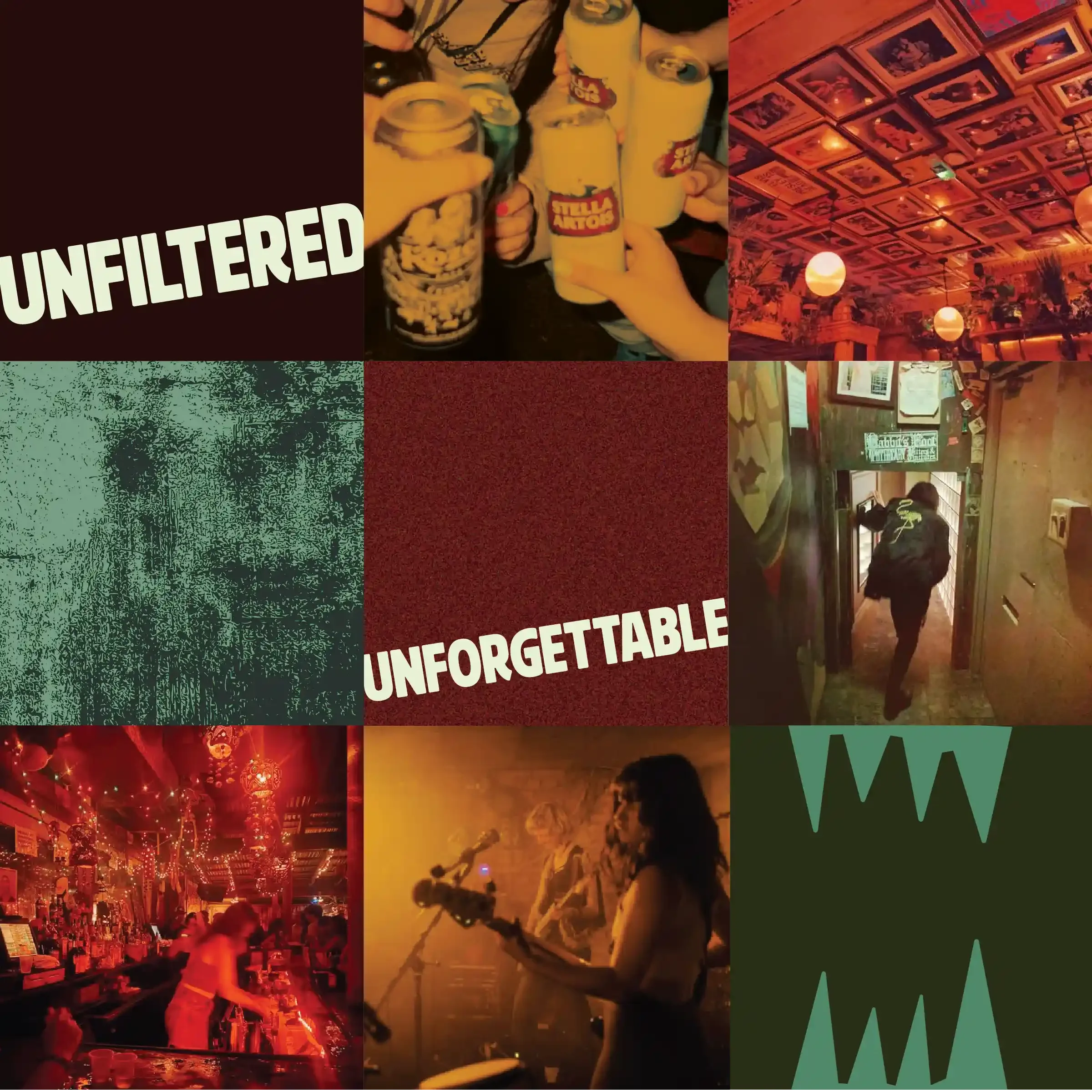
To establish the brand’s visual direction, I created a series of brand squares exploring color, photography, and graphic motifs before designing the logo. Feedback on these explorations helped refine the visual identity and define the brand’s aesthetic.
Visual style exploration
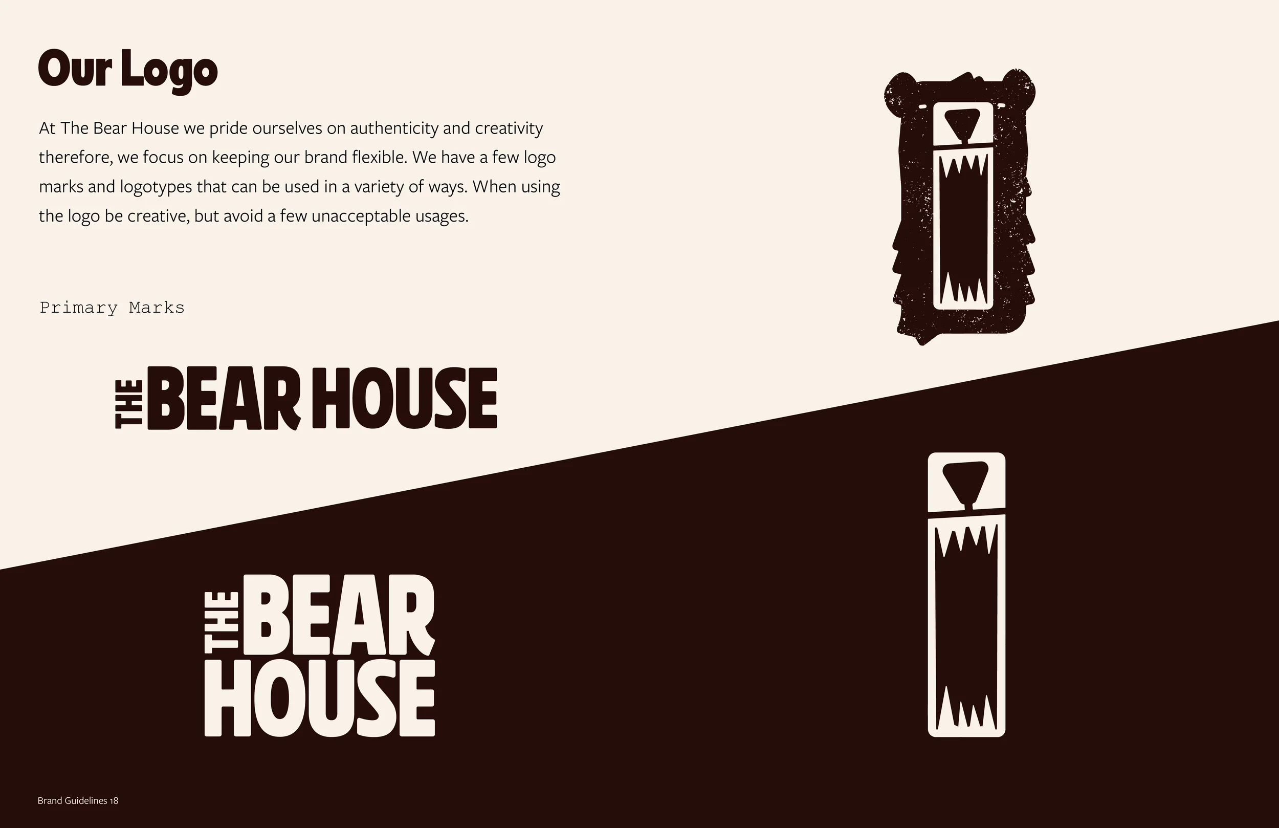
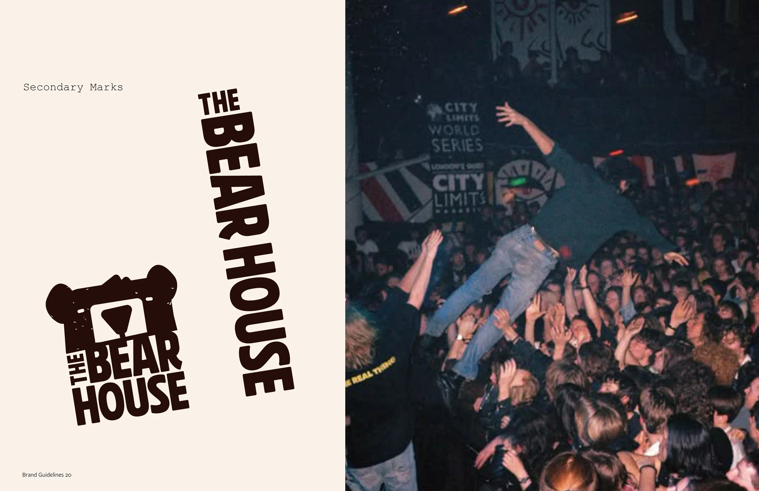
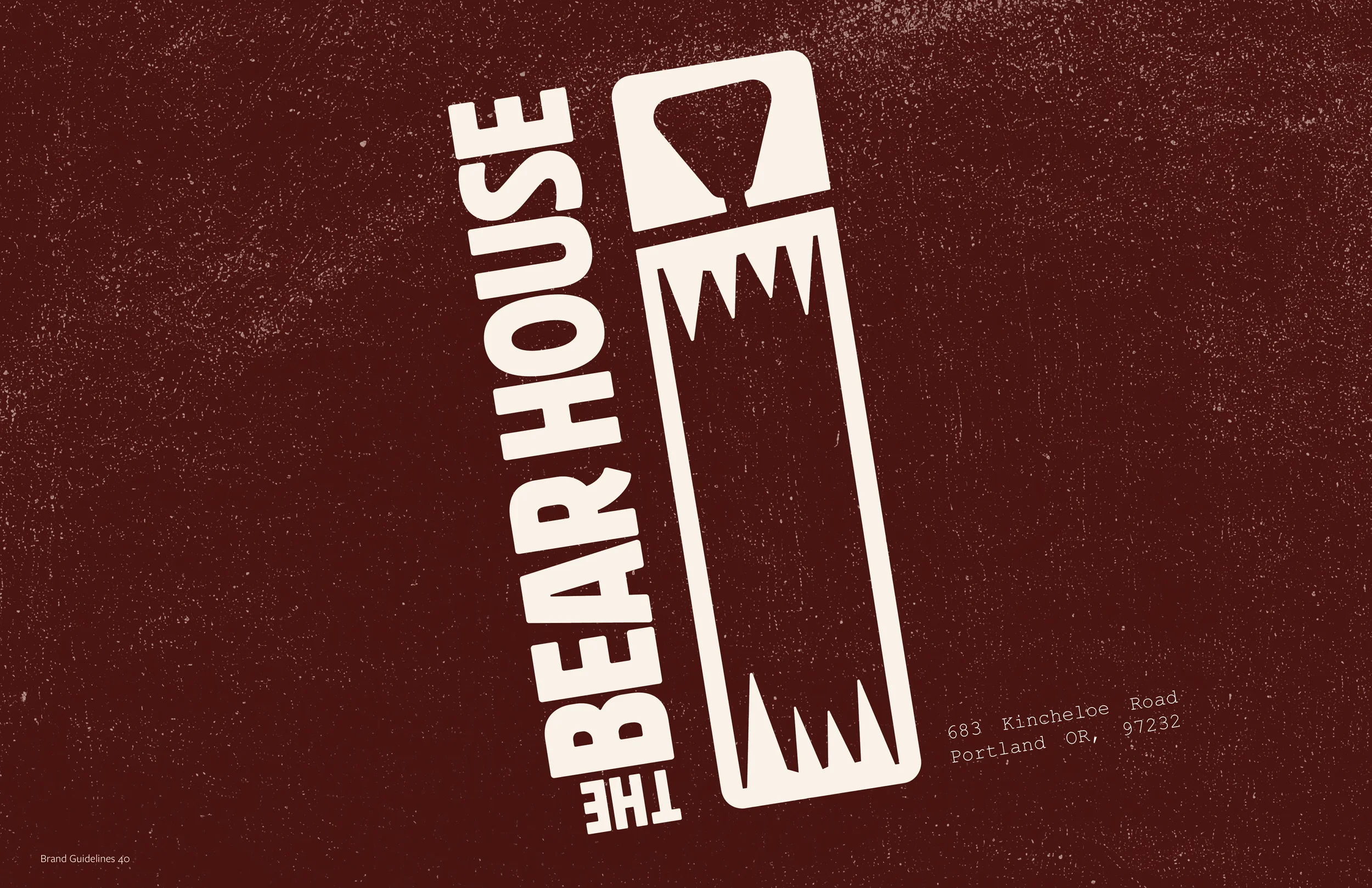
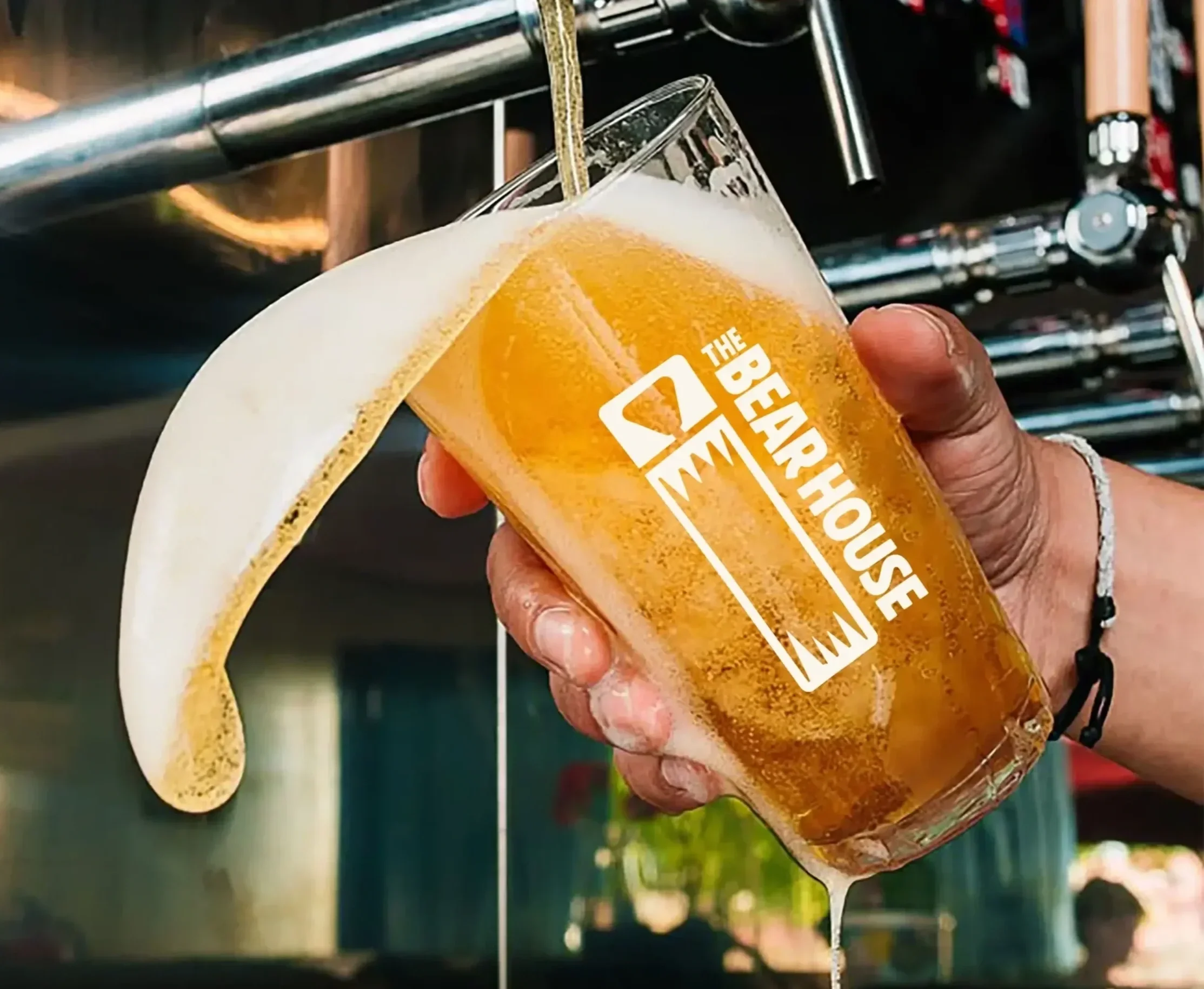
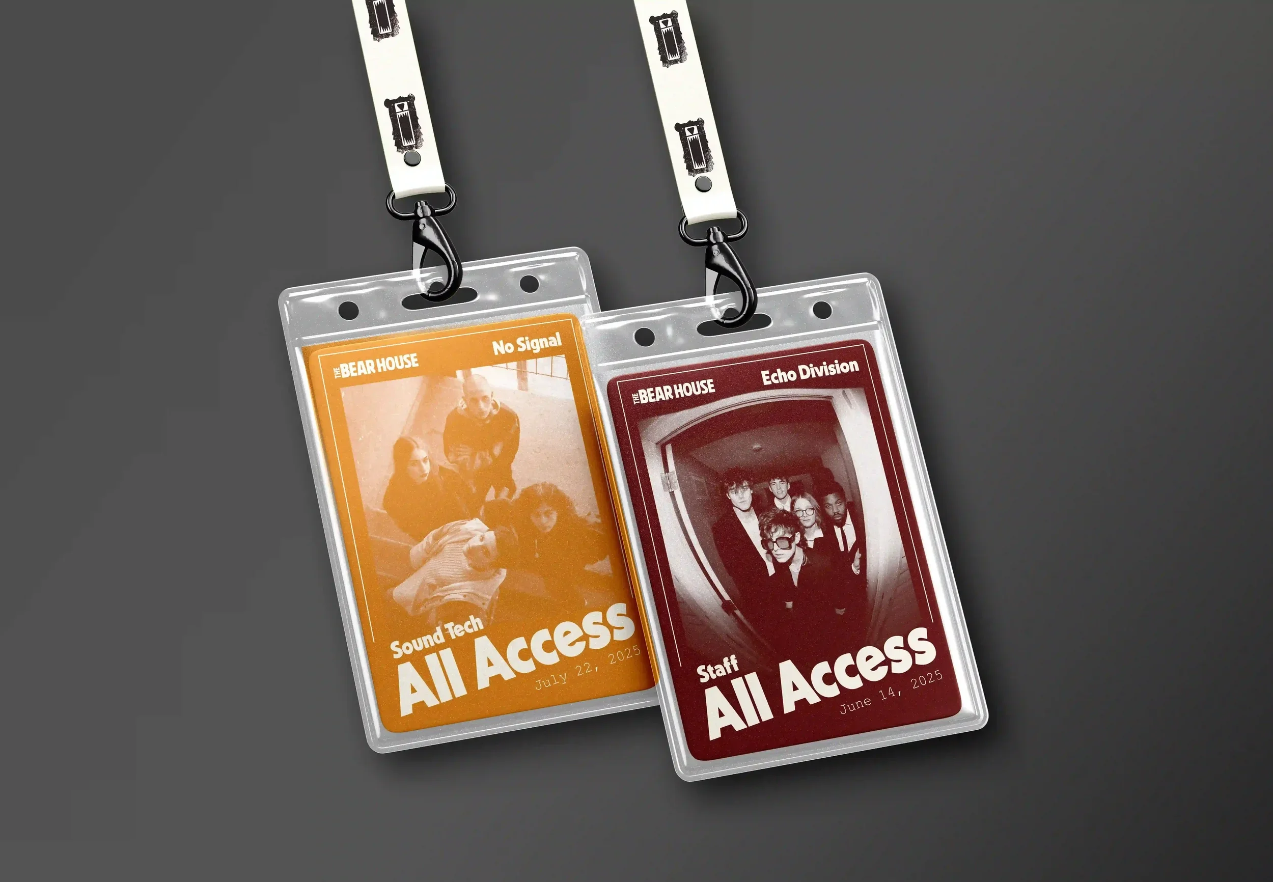
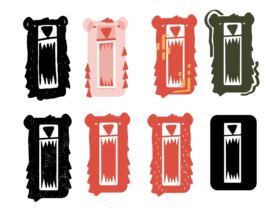
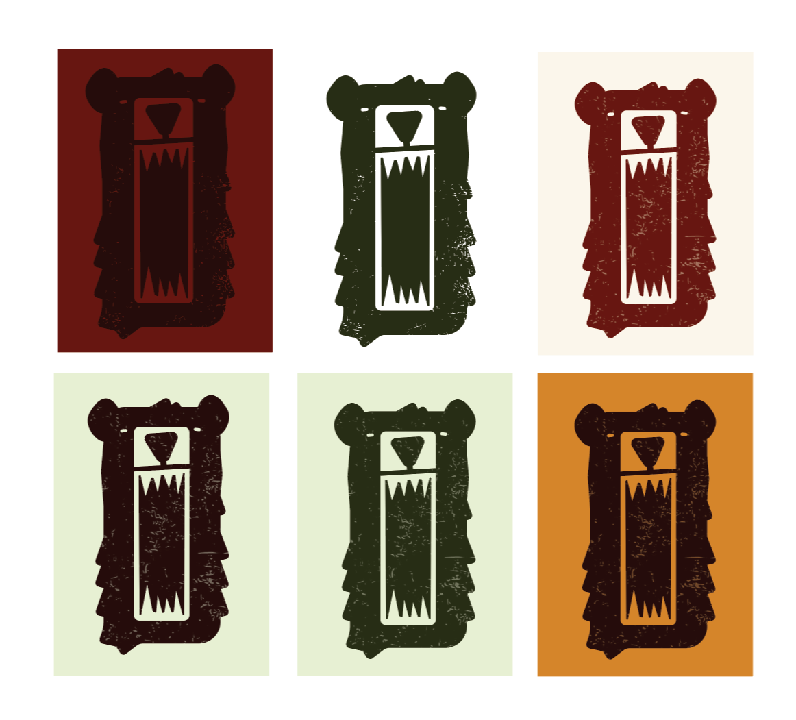
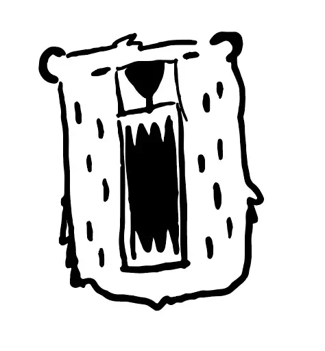
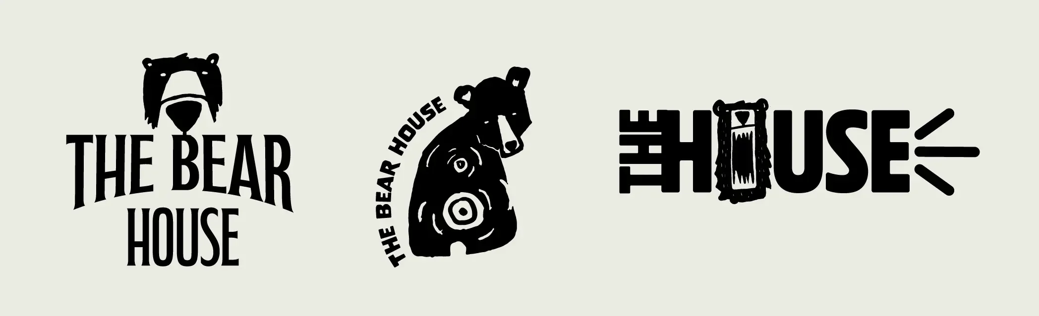
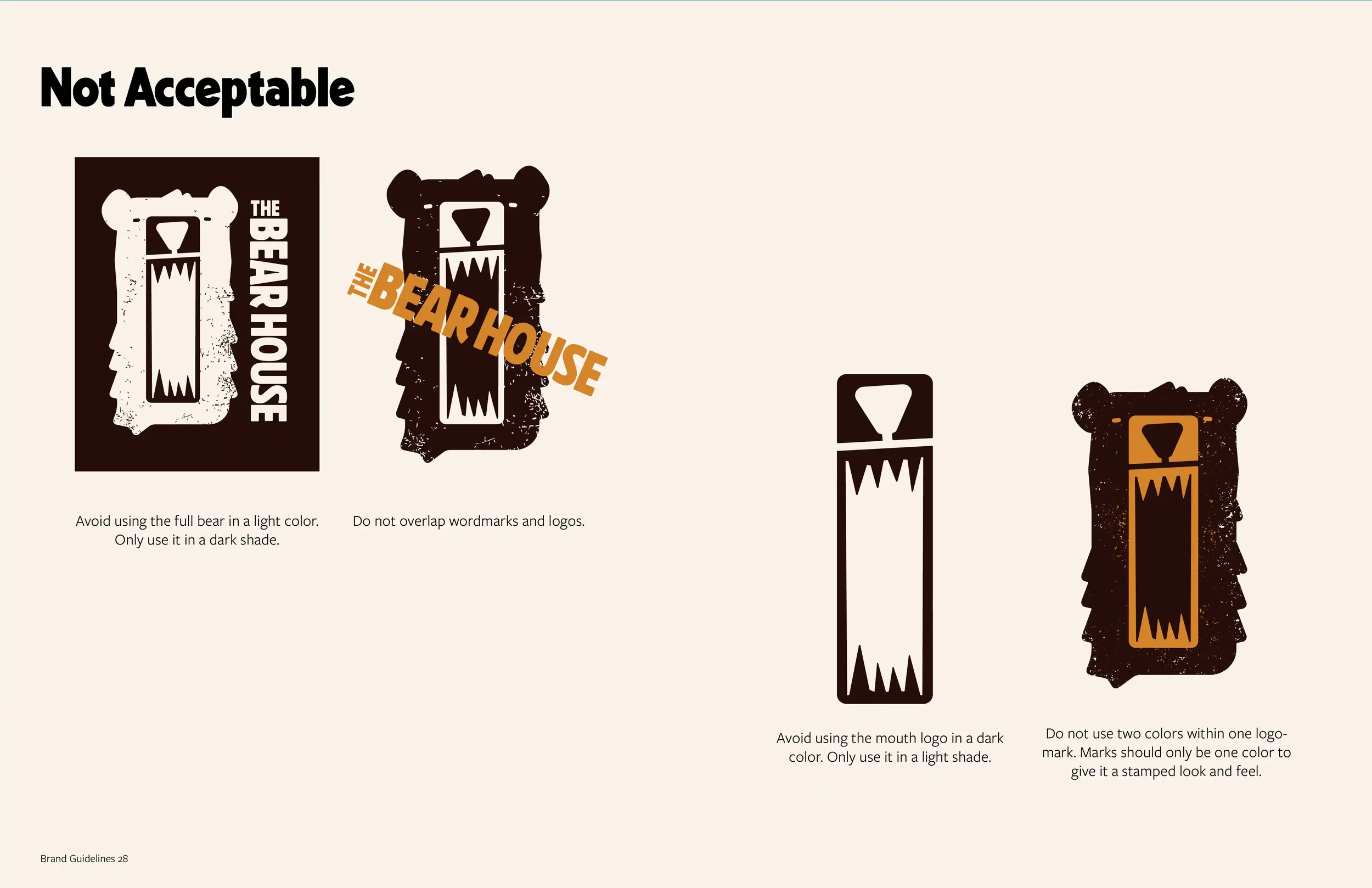
Flexibility was central to the logo system. A growling bear was chosen to capture the venue’s loud, unfiltered energy, and three interchangeable marks were created to adapt across different applications and backgrounds.
Logo development
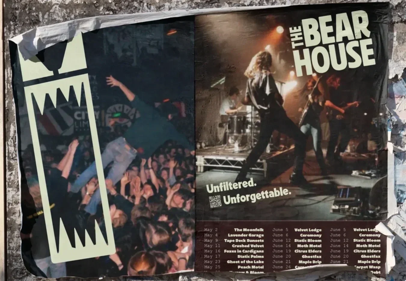
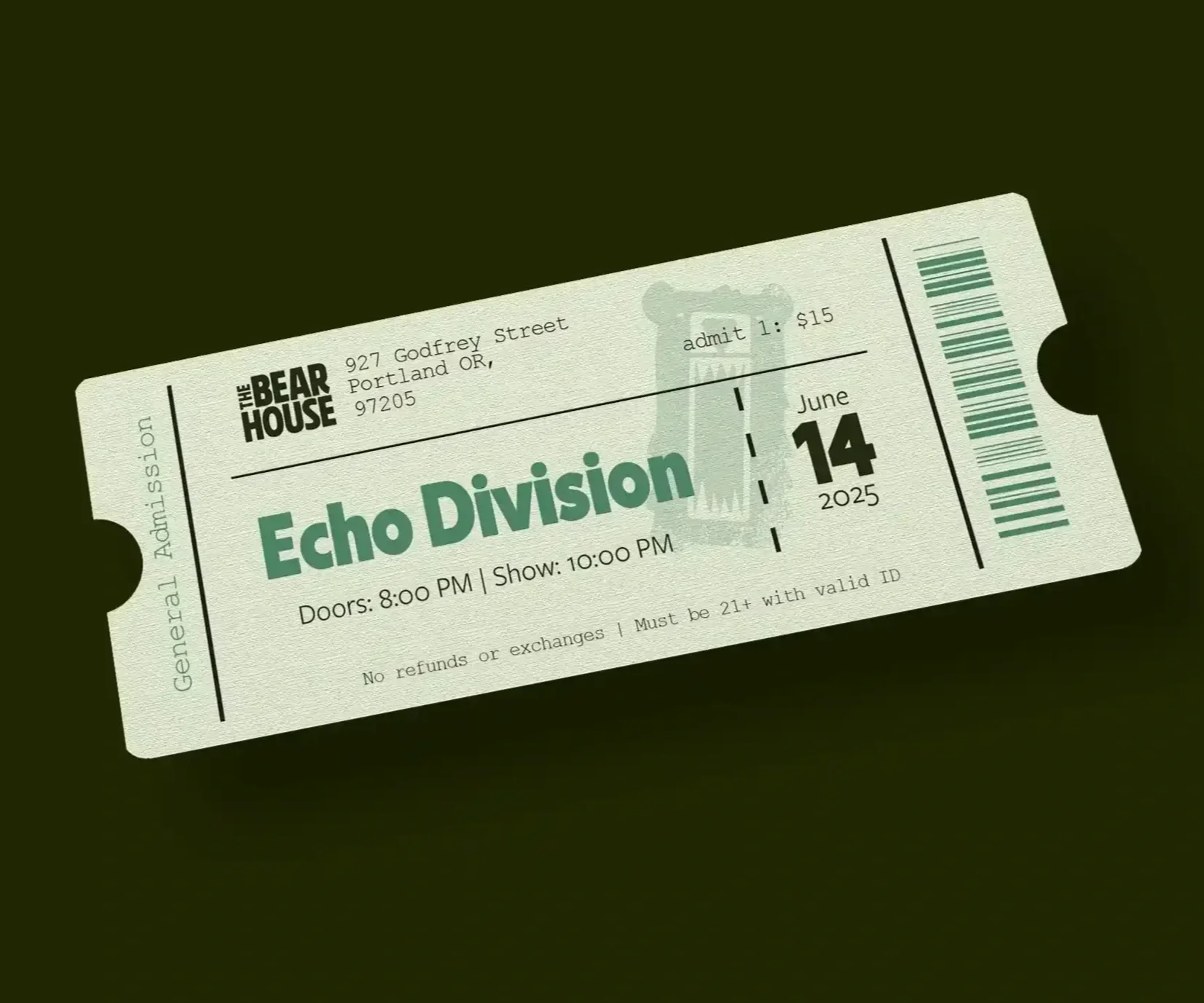
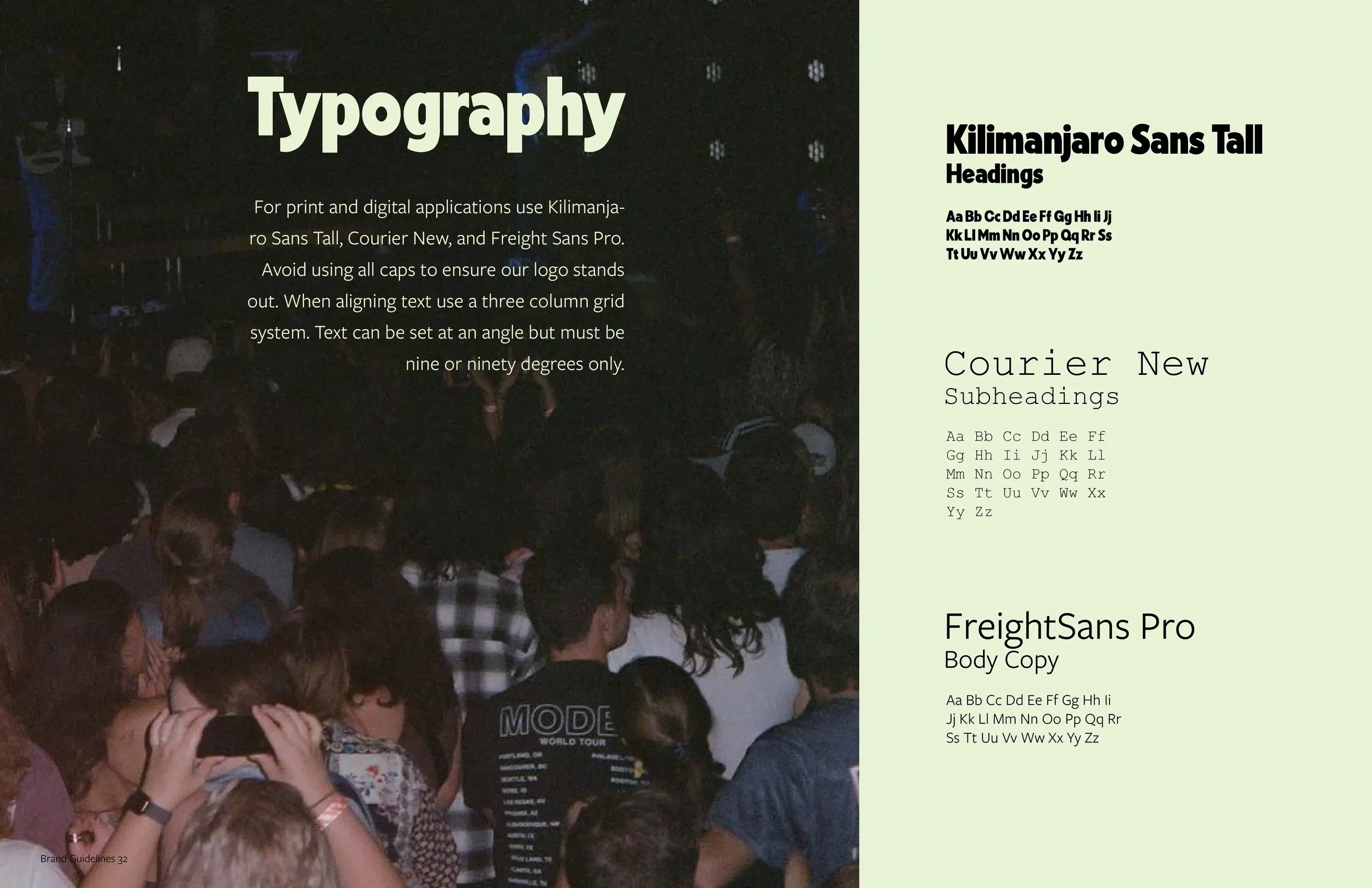
To reflect the brand’s unfiltered energy, I developed a flexible typography system that combines angled and straight elements. Experimenting with dynamic layouts helped create movement while maintaining clarity across applications.
Grid system


This project challenged me to translate emotion and energy into flexible design. This resulted in creating a brand system that feels as alive and authentic as the artists it represents.